Kitchen Paint Colors With White Cabinets. Best Wall Color Ideas
White cabinets are supposed to make everything easier, right? You pick them because they’re bright, they’re timeless, and supposedly, everything goes with them. And then you stand in the paint aisle holding seventeen chips and realize… nothing looks the way you expected.
I’ve been there. Most homeowners have. The truth is, white cabinets are flexible. But they’re not foolproof. The wrong wall color can make your cabinets look yellow, cold, dingy, or just plain off. And because kitchens have so many competing surfaces — countertops, backsplash, floors, hardware, appliances picking wall paint is genuinely more complicated than it sounds.
This guide will walk you through the best kitchen paint colors with white cabinets, explain why some combinations work, and others don’t, and help you make a decision you’ll actually be happy with.
What Undertone Do Your White Cabinets Actually Have?
This is the step most people skip, and it’s the reason so many kitchen paint projects go sideways.
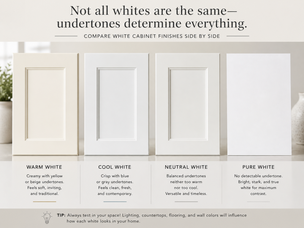
Most white cabinets are not a clean, neutral white. They usually lean somewhere warm, cool, or slightly gray, nd that undertone quietly affects every color decision in the room.
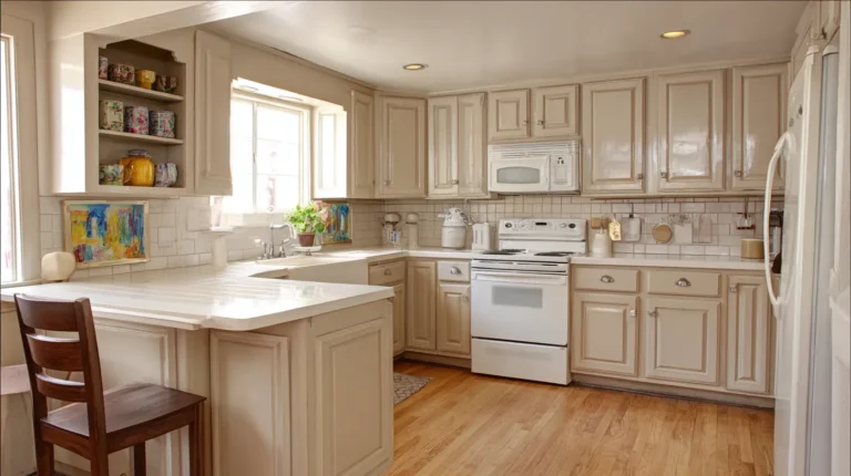
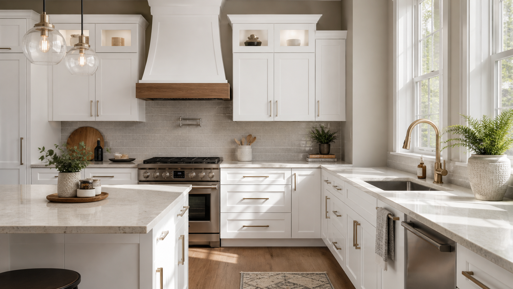
Warm white cabinets look creamy, ivory, or slightly yellow. You’ll see this a lot in painted wood cabinets, especially older ones, and in popular paint colors like Antique White or Navajo White. These cabinets pair naturally with warm wall colors: cream, greige, warm beige, taupe, sage, and earthy neutrals. If you put a cool gray or icy blue on the walls next to warm white cabinets, the cabinets tend to look more yellow than you realized, which is usually not the goal.
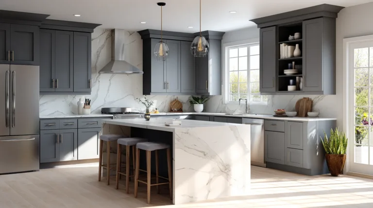
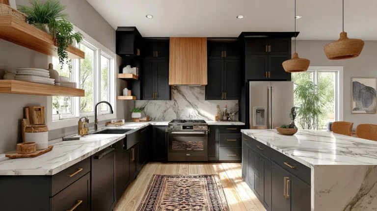
Cool white cabinets have blue, gray, or crisp undertones. Think of that sharp, clean white you often see in modern kitchens or freshly painted shaker cabinets in something like Benjamin Moore Chantilly Lace or Sherwin-Williams Extra White. These work great with gray, dusty blue, navy, charcoal, and cool greens. Pair them with a warm, creamy beige, and they can start looking stark.
Neuts still shift depending on what’s around them.
To figure out your cabinet undertone, hold a pure white piece of paper next to the cabinet door. If the cabinet looks yellow or cream compared to it, it’s warm. If it looks blue, gray, or lavender, it’s cool.
The Best Neutral Paint Colors With White Cabinets
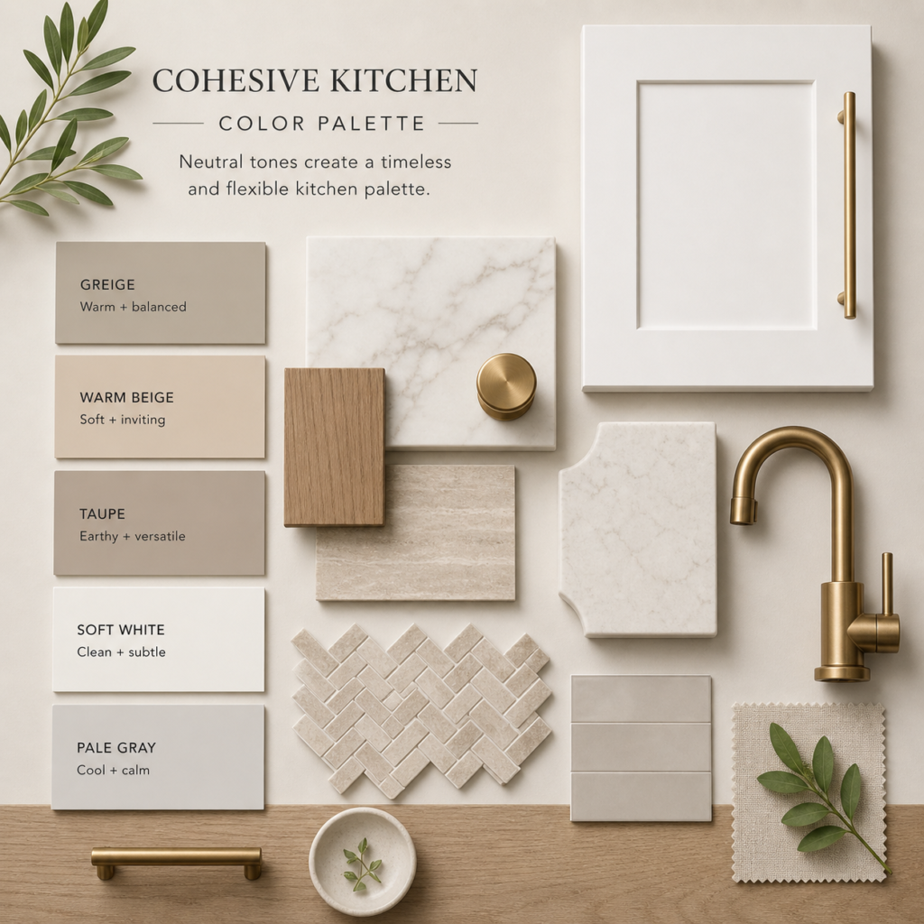
If you’re not sure where to start, neutrals are your safest ground. They work in almost any kitchen style, and they age well.
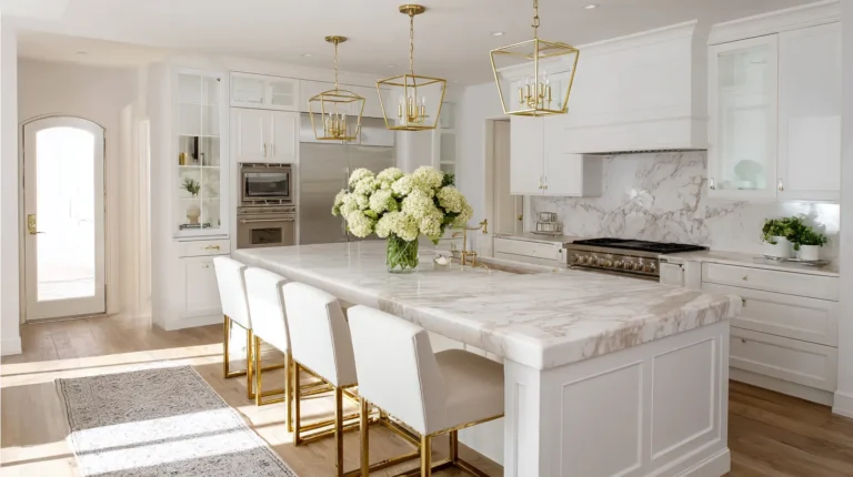
Soft, warm white is the quiet workhorse. Painting walls a shade slightly warmer and softer than your cabinets creates a layered, intentional look, not a flat all-white box. This works particularly well if your kitchen opens into a living area and you want everything to feel cohesive. It’s also a good backdrop for brass fixtures, wood open shelves, and natural stone. Just be careful pairing a creamy wall with cool white cabinets. That contrast can make the whole room feel confused.
Greige, the gray-beige blend, might be the most universally useful wall color in any kitchen with white cabinets. It adds warmth without going full-on yellow. It has enough gray to feel modern, but enough beige to feel soft. It plays well with quartz counters, marble-look surfaces, wood floors, and pretty much every hardware finish from brass to matte black. If you’re updating a kitchen and you’re not sure what direction to go, greige is a reasonable place to land while you figure the rest out.
Warm beige works when you want your kitchen to feel cozy rather than crisp. It’s the right call for kitchens with butcher block counters, woven window shades, unlacquered brass, or warm-toned wood floors. The risk is going too yellow — especially if your cabinets already have cream in them. When two warm tones are too similar in value, the kitchen can feel heavy or dated. Make sure there’s some contrast somewhere, even if it’s just through dark hardware or a contrasting countertop.
Light taupe adds quiet depth without pulling too warm or too cool. It’s useful when you want something more interesting than off-white but don’t want to commit to a color. Taupe does have a reputation for being tricky because it can look lavender, brown, pink, or gray depending on the light — so sample it carefully in your actual kitchen before buying a full gallon.
Pale gray is clean, modern, and very practical with cool white cabinets, marble counters, and stainless steel appliances. The main thing to watch: in a kitchen with limited natural light, pale gray can feel cold and flat, especially under cooler LED bulbs. If your kitchen faces north or doesn’t get much sun, test before you commit.
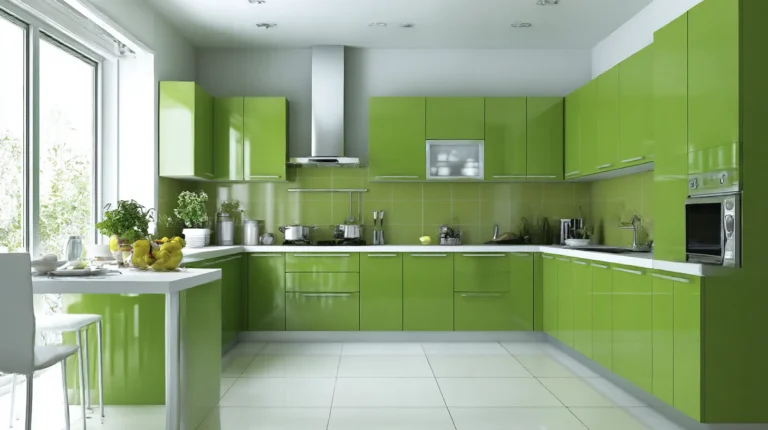
The Best Colorful Paint Colors With White Cabinets
White cabinets are genuinely one of the best foundations for a color moment on the walls. You get the brightness and lightness of white cabinetry while still giving the room personality.
Sage green has been everywhere for a while, and there’s a real reason for it — it works. It’s soft enough to feel calm but interesting enough to feel intentional. It goes with warm white cabinets, cool white cabinets, wood floors, brass hardware, black accents, and most stone countertops. For a grayer, more muted sage, look for tones that lean toward olive or gray-green. For something a little warmer and earthier, look for sage with more yellow in it. Either way, it’s a low-risk color choice that tends to hold up over time.
Dusty blue adds freshness and a slight coastal feeling without going full beach house. It pairs especially well with cool white cabinets, marble or white quartz counters, nickel hardware, and light wood floors. If your cabinets are creamy, look for a blue with a little gray or green in it rather than a sharp, saturated blue — otherwise the warm cabinet undertone and the cool wall color will fight each other.
Blue-gray is the quiet version of dusty blue. It’s color without feeling too colorful, which some people find easier to commit to. It works well in modern kitchens with cool-toned finishes and is a nice alternative to plain gray if you want something slightly more interesting.
Navy is for people who want contrast and commitment. It can look classic, dramatic, or coastal depending on how you style it. The smartest way to use navy in most kitchens is on one accent wall, the kitchen island, or an adjacent pantry or dining nook, rather than every surface. If you do go full navy walls, make sure the kitchen has good light. Dark colors are beautiful, but they absorb light, and that changes the whole mood of the room.
Charcoal and soft black can be stunning with white cabinets — high contrast, sophisticated, and very intentional. They’re better suited to kitchens with solid natural light, warm wood or brass accents, and simple, well-executed design. One honest note: dark paint is unforgiving of wall imperfections. Bumps, nail holes, and texture show more on dark walls, so prep matters.
Muted terracotta or clay is one of those unexpected combinations that genuinely works. When the shade is soft and dusty, not a bright orange, it gives white cabinets a warm, earthy backdrop that feels collected rather than designed. It’s great in farmhouse, Mediterranean, or eclectic kitchens, especially with warm wood details and brass or bronze hardware.
Dusty pink is another surprising one that earns its place when done right. Not bubble gum, not blush — a grown-up, muted pink with some gray in it. It works in cottages, vintage kitchens, and spaces that are intentionally romantic or feminine. Pair it with warm white cabinets, brass fixtures, and soft stone counters, and it feels like something out of a really well-done European kitchen renovation.
Olive green is deeper and moodier than sage. It’s a good call when you want contrast and earthiness without going dark blue or gray. It’s best in kitchens with good light and warm wood accents. In a small or dim kitchen, use it on one wall instead of all four.
How Your Countertops and Backsplash Change Everything
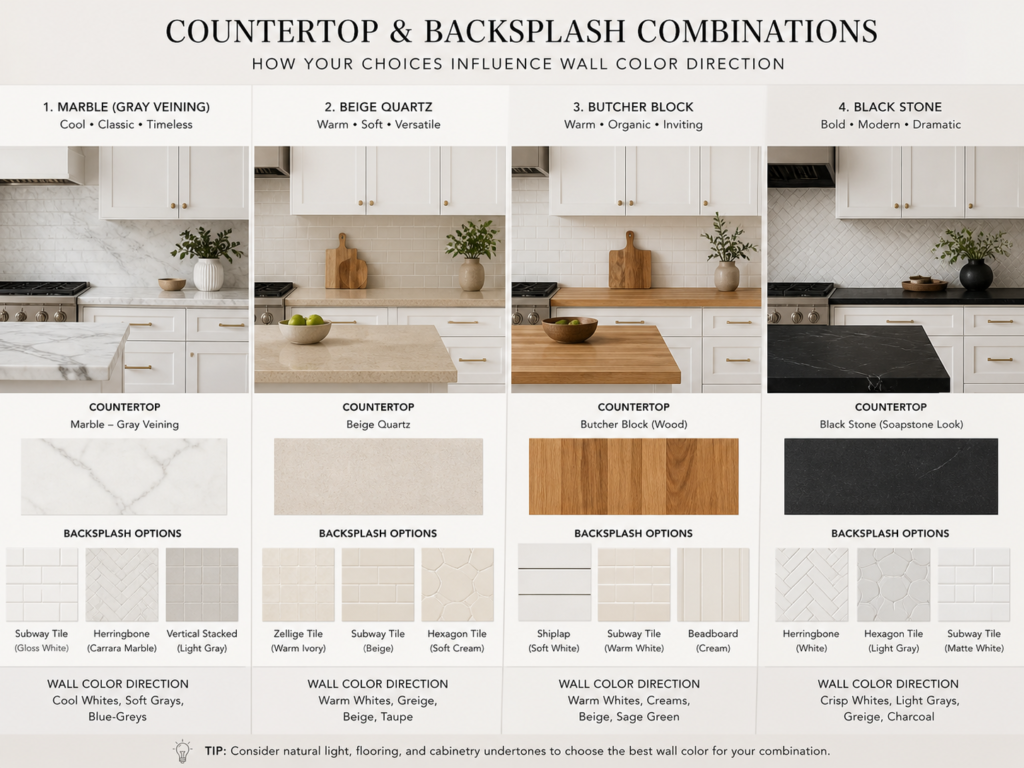
Wall color doesn’t exist in isolation. Your countertops and backsplash are big fixed pieces that your wall color has to work with.
If you have white quartz or marble-look counters, look at the veining first. Gray veining pulls toward cooler wall colors, pale gray, sage, dusty blue, or cool white. Beige or gold veining pulls toward warmer options, such as greige, warm white, taupe, or soft sage.
If you have butcher block or wood counters, warm wall colors almost always work best. Greige, creamy white, warm beige, sage, and muted clay all feel right with wood.
If you have black countertops, you already have a strong contrast built in. Your walls can go neutral and let the counters do the work, or you can lean into the drama with navy or charcoal. Either direction works — it’s a question of how much visual weight you want.
If you have a busy backsplash — a patterned tile, a bold color, or a lot of movement — keep the walls simple. Pull a quiet neutral from the tile rather than adding a new competing color to the mix.
A Word on Paint Finish
This doesn’t get mentioned enough: the finish matters as much as the color in a kitchen.
Kitchens deal with moisture, grease, steam, and the general chaos of daily life. A flat or matte finish on kitchen walls looks beautiful in photos, but is genuinely difficult to wipe clean. For kitchen walls, eggshell gives you a low sheen that cleans reasonably well and doesn’t highlight every wall imperfection. Satin or pearl is a step up in washability and works well in high-traffic or heavily used kitchens. Semi-gloss is great for trim, window frames, and detail work. It cleans easily, but it does show wall bumps and texture more than lower sheens.
The exact names vary by paint brand. What Benjamin Moore calls “pearl” might be different from what Sherwin-Williams calls “satin,” so compare the actual sheen level before you buy.
Mistakes Worth Knowing About Before You Paint
Skipping the undertone check. This one causes the most regret. Choosing a wall color without understanding whether your cabinets are warm or cool is the fastest way to end up with a combination that looks wrong,g and you can’t quite explain why.
Choosing paint color next to the cabinet chip, not the actual cabinet. Paint chips are small, surrounded by white, and seen under store lighting. They lie to you. Always compare your samples against the real cabinet door in the real kitchen.
Putting a cool gray with cream cabinets. Cool gray makes warm, creamy cabinets look more yellow. If your cabinets are warm, start your search in the warm color: greige, taupe, beige, warm white — before exploring cooler colors.
Painting the whole kitchen a dark color without testing. Dark colors are gorgeous on Pinterest boards and genuinely difficult to predict in person. They change dramatically from morning to evening, from natural to artificial light. Test large samples on multiple walls before you buy more than a quart.
Getting too close to the wall and the white cabinet. If you want white or off-white walls with white cabinets, the two whites need to be clearly intentional, either a real match or a clear contrast. Two similar but not identical whites sitting next to each other can make one look dirty or slightly wrong.
How to Test Paint Before You Commit
Don’t choose kitchen paint from a tiny two-inch chip. Kitchens are reflective environments, counters, appliances, backsplash, floors, and the color you see in the store will not be the color you see on the wall.
The process that actually helps: pick three to five colors you’re genuinely considering. Paint large boards at least 12 by 12 inches, bigger if you can — or use peel-and-stick samples. Stick them directly next to the cabinets, near the countertop, and close to the backsplash. Look at them in the morning when the sun comes in, in the middle of the day, in the evening under your kitchen lights, and at night with the overhead light on.
The color that looks consistently good across all those conditions is the right one. The color that only looks good at noon on a sunny day is not your answer.
If you’re torn between two similar options, choose the one that works better with the fixed finishes you can’t change: the cabinets, counters, backsplash, and flooring.
So, Where Should You Actually Start?
If you’re standing at the beginning of this decision and feeling overwhelmed, here’s the short version:
White cabinets pair beautifully with greige, soft warm white, sage green, dusty blue, pale gray, taupe, navy, and charcoal — but which one is right for your kitchen depends on the undertone of your specific white, what your countertops and backsplash look like, how much light the room gets, and what style you’re going for.
There’s no universally correct answer. But there is a correct answer for your kitchen. Start with your cabinet undertone, pull in the countertop and backsplash as guides, test samples in real light, and permit yourself to narrow it down from there.
The goal isn’t the most popular color. The goal is a kitchen that feels like you actually meant it