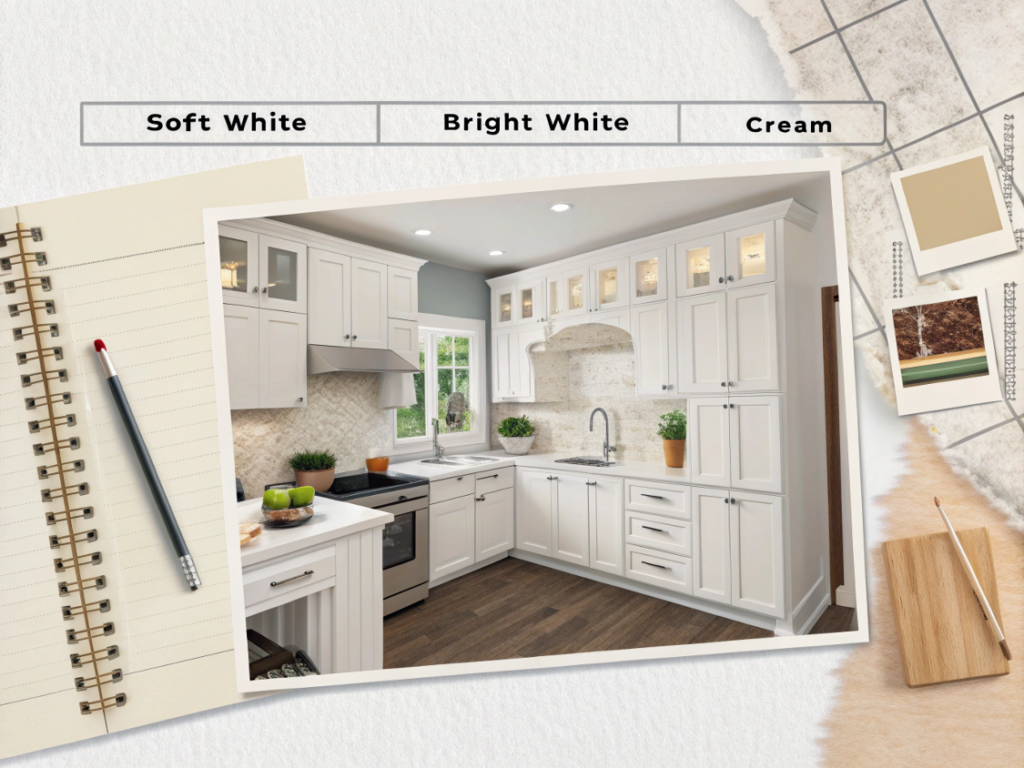
Best White Paint Colors for Kitchen Cabinets 2025
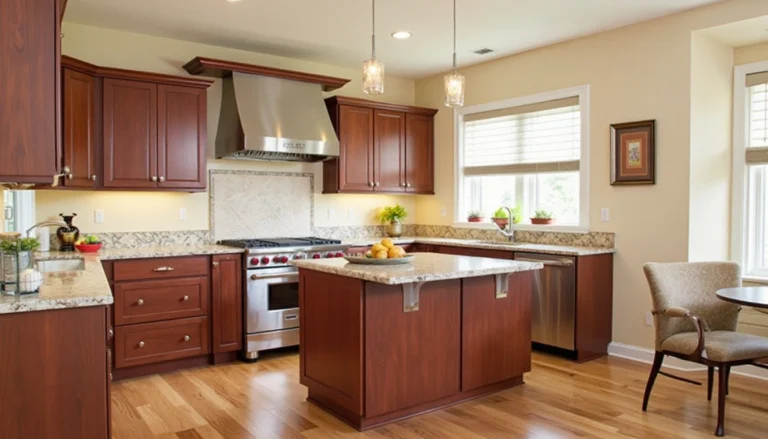
When I started repainting my grandma’s 1970s kitchen cabinets, hands trembling, paintbrush in one hand, coffee in the other, I had no idea how complicated white could be. I figured, “Just grab a white. How hard can it be?” Famous last words.
Turns out, choosing the best white paint color for kitchen cabinets is less about picking a color… and more about understanding light, undertones, and the mood you want to live in. Some whites felt too cold. Others turned yellow the moment the sun hit them. And one even made my beloved oak floors look weirdly orange (we do not speak of that one).
If you’ve ever stood in a hardware store, drowning in swatches like “Swiss Coffee,” “Chantilly Lace,” and “Decorator’s White,” wondering if your eyeballs were broken, welcome. You’re not alone. I’ve been there. That moment when all the whites start blending together and you question your life decisions? Yep.
This guide is here to make sure you don’t go through that spiral. I’ve tested, researched, and obsessively stared at drying cabinets under 3 different bulbs just to bring you this: a no-fluff, real-world guide to the best white paint colors for kitchen cabinets, whether you’re after cozy farmhouse warmth, sleek modern brightness, or something in between.
Let’s find your white. The one that makes your kitchen feel like home.
Quick Snapshot Top White Paints for Cabinets at a Glance
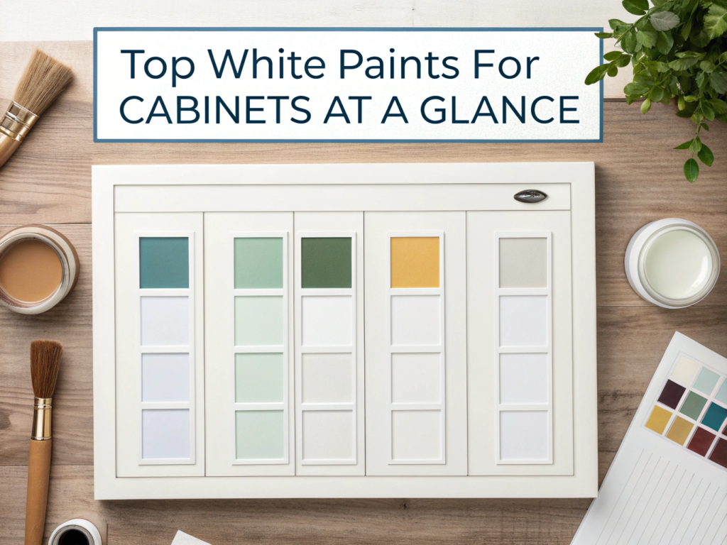
| Paint Name | Brand | LRV | Undertone | Best For |
|---|---|---|---|---|
| White Dove | Benjamin Moore | 83.16 | Warm-neutral | All-around versatility, soft lighting |
| Alabaster | Sherwin-Williams | 82 | Warm creamy | Cozy traditional kitchens |
| Pure White | Sherwin-Williams | 84 | Slight yellow/neutral | Bright without feeling cold |
| Chantilly Lace | Benjamin Moore | 90 | Cool, bright white | Ultra-crisp modern spaces |
| Cloud White | Benjamin Moore | 85 | Soft warm | Rooms with wood tones and brass |
| Extra White | Sherwin-Williams | 86 | Cool bluish | High contrast, modern palettes |
| Snow Bound | Sherwin-Williams | 83 | Cool-gray undertone | Soft contrast with darker accents |
| Simply White | Benjamin Moore | 89.52 | Slightly warm | Airy traditional or transitional kitchens |
| Paper White | Benjamin Moore | 74 | Cool gray-leaning | Subtle depth, especially in natural light |
| High Reflective White | Sherwin-Williams | 93 | True white | Maximum brightness, modern minimalism |
| Decorator’s White | Benjamin Moore | 84.6 | Cool gray | Soft contrast, east/west lighting shifts |
| Origami White | Sherwin-Williams | 76 | Slight yellow/lavender | Subtle warmth in natural light |
| Natural Cream | Benjamin Moore | 64.78 | Beige-greige | Soft warmth without yellowing |
💡 Tip: LRV (Light Reflectance Value) tells you how bright a paint color is. Higher = brighter. Lower = moodier.
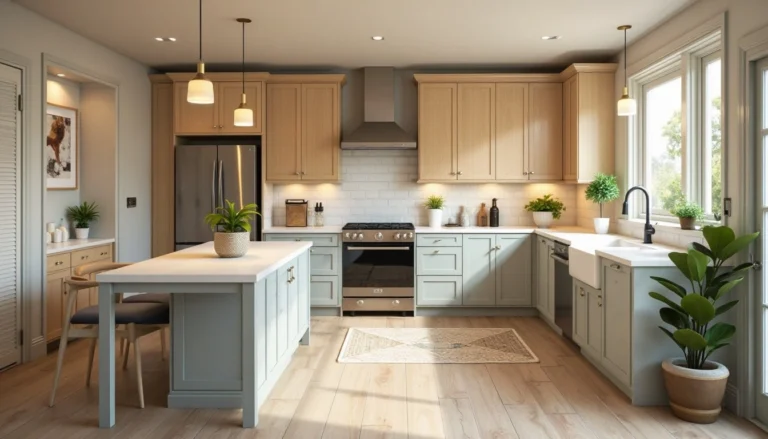
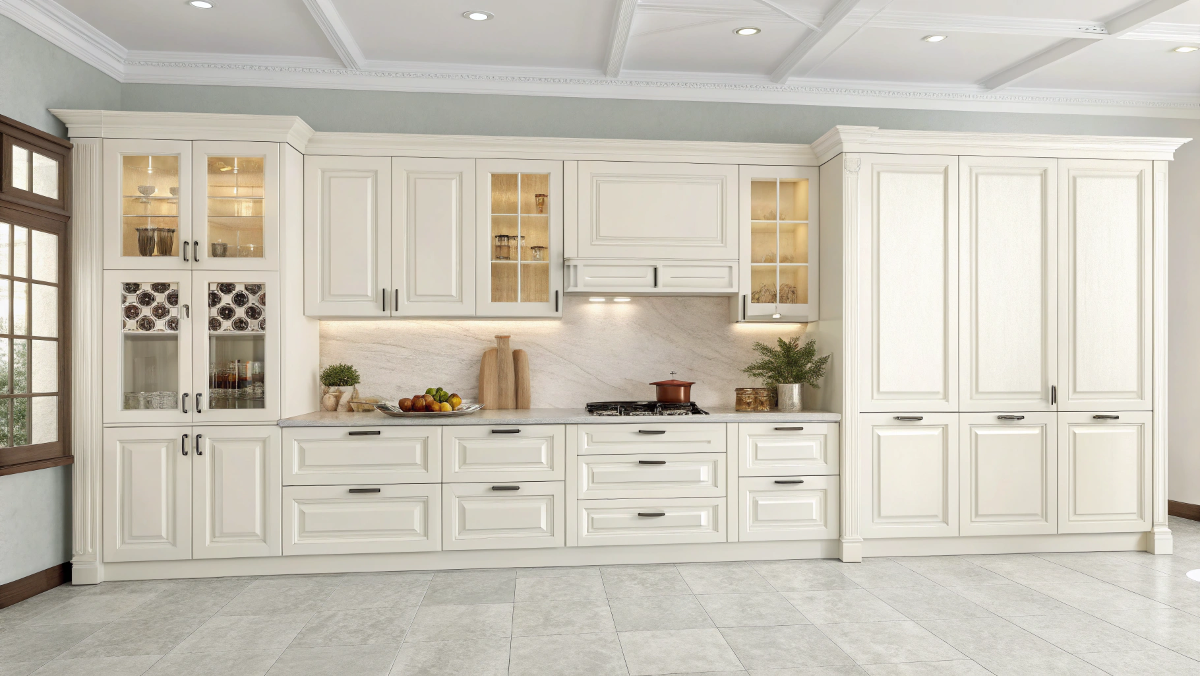
Soft & Cozy Whites (Warm Undertones)
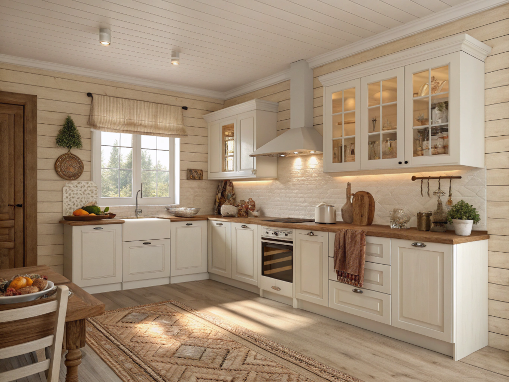
Warm whites have a way of making a kitchen feel lived-in, in the best way. They soften hard surfaces, play nicely with wood, and hide the occasional fingerprint better than their crisp cousins. Here are my favorite warm whites that feel like a warm blanket on a Sunday morning.
White Dove – Benjamin Moor
White Dove is like the Goldilocks of warm whites. It’s soft, but not creamy. Clean, but not stark. Its undertones are warm-neutral with just enough gray to keep things grounded.
I’ve used it in kitchens with oak floors, white quartz, and even old ceramic tile, somehow, it just works. It brings cohesion without stealing the show, which is kind of perfect for cabinets.
Why I love it:
- LRV: 83.16
- Works in nearly any light (even tricky north-facing spaces)
- Doesn’t read yellow or sterile
- Pairs beautifully with brass, black, or even matte nickel hardware
Pair it with: Marble counters, soft greige walls, unlacquered brass knobs
Alabaster – Sherwin-William
This one’s for my fellow lovers of that cozy, creamy, “grandma’s kitchen but make it chic” vibe. Alabaster is warm without being golden, and soft without being dull.
I once used it in a 1920s bungalow kitchen and swear it made the room feel 5 degrees warmer in a good way.
Why it stands out:
- LRV: 82
- Beautiful with natural wood, butcher block, or vintage details
- Ideal for north-facing or cool LED-lit kitchens
- Offers just enough contrast with white trim
Heads-up: If you’re chasing that stark gallery look, skip this one.
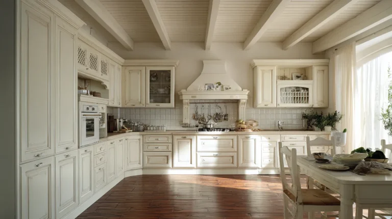
Cloud White – Benjamin Moore
This shade feels like morning sunlight through sheer curtains. It’s warm but subtle. Creamy, but somehow still crisp.
Cloud White plays especially well with rustic textures: wood beams, copper pans, maybe that old kitchen table you refuse to part with. It’s not trendy, it’s timeless.
The vibe:
- LRV: ~85
- Gentle warmth without leaning yellow
- Elevates cozy farmhouse or classic vintage looks
- Looks beautiful next to antique brass or oil-rubbed bronze
Watch for: Slightly too soft in super bright spaces, it can look flat next to ultra-white appliances.
Natural Cream – Benjamin Moore
Okay, this one’s a curveball. Technically not “white” by the numbers (its LRV is only 64.78), but hear me out, if your kitchen gets tons of natural light and you want a creamy, greige-adjacent cabinet color that feels comforting without looking beige, this is the one.
It reads “light and creamy” in a sun-drenched space, but has the depth to hold its own against bold counters or dark flooring.
Why I’d use it again:
- Undertone: beige-greige, but no weird purple shift
- Feels modern and nostalgic
- Perfect with earthy palettes or muted greens
Is White Dove too warm for a modern kitchen?
Not at all. White Dove’s balanced undertones make it feel just as appropriate in modern, minimal spaces as it does in traditional ones. Pair it with sleek black pulls and matte finishes to lean contemporary.
Clean & Crisp Whites (Neutral to Cool Undertones)
Not all whites are warm and fuzzy, and that’s not a bad thing. Cool or neutral whites bring a calm, fresh energy that works wonders in minimalist, modern, or coastal kitchens. If your vibe is more “air and light” than “warm hug,” this section is for you.
Pure White – Sherwin-Williams
Pure White is a modern classic. It’s bright and clean, but still has just the faintest touch of warmth, enough to keep your cabinets from feeling sterile.
In a friend’s new-build kitchen, this shade was a lifesaver: crisp against navy walls, but still soft enough for everyday living.
Quick Details
- LRV: 84
- Technically neutral, but ever-so-slightly warm
- Doesn’t go yellow, even under LED lights
- Flexible with bold or muted palettes
Best for: New construction, transitional homes, open-plan kitchens
Simply White – Benjamin Moore
This one’s a little trickier, its name says “simple,” but its undertone is a whisper of yellow. Not enough to scream cream, but enough to soften the edges.
I like it best in spaces that feel cold or flat, it adds life without looking old-fashioned.
The gist
- LRV: 89.52
- Appears clean and neutral in bright spaces
- Has a quiet glow in cloudy light
- Nice bridge between warm and cool tones
Pair with: Edgecomb Gray walls, stainless steel, or muted blue backsplashes
Extra White – Sherwin-Williams
Don’t let the name scare you, it’s not blinding. Extra White is crisp with just a hint of coolness, which makes it perfect if you want contrast without committing to stark white.
I’ve seen it used beautifully against deep navy or forest green lower cabinets; it holds its own without looking icy.
Why it works
- LRV: 86
- Subtle blue-gray undertone (barely noticeable)
- Works with both warm and cool palettes
- Good for clean contrast with dark elements
Watch out for: In dim rooms, it can fall flat or feel a bit cold.
Snow Bound – Sherwin-Williams
This one’s sneaky. At first glance, it feels warm. But next to true white, you’ll see its cool, grayish undertone.
Snow Bound gives off a soft, powdery vibe. Think foggy mornings, pale linens, and quiet sophistication. It’s a favorite for kitchens that lean coastal, Scandinavian, or minimal.
Profile:
- LRV: 83
- Soft, muted gray-white
- Works beautifully with soft grays, beiges, and natural wood tones
- Doesn’t compete with colorful decor
Will cool white cabinets look too harsh in a cozy kitchen?
Not if you balance your materials. Pairing cool whites with warm wood, woven textures, or matte hardware helps soften the look and add warmth back into the space.
Bold & Bright Whites (High-LRV + Pure Whites)
These whites are the show-stealers, the ones with serious bounce that flood your kitchen with light. They’re crisp, airy, and undeniably modern. But bright whites are a bit like high heels: gorgeous, but you’ll want the right fit.
Chantilly Lace – Benjamin Moore
This is what people think of when they hear “pure white.” But unlike many ultra-whites, Chantilly Lace manages to be clean without being cold, and bright without being jarring.
It’s the closest I’ve seen to true white in real-world lighting, and it’s gorgeous.
Why it shines
- LRV: 90
- Virtually no undertone, clean, bright, and balanced
- Works with both cool and warm accents
- Beautiful in homes with big windows or open spaces
Note, This one shows everything, make sure your surface prep is on point.
High Reflective White – Sherwin-Williams
If Chantilly Lace is a floodlight, High Reflective White is a spotlight. With an LRV of 93, it’s one of the brightest whites you can buy, and it doesn’t mess around.
This is the one for ultra-modern kitchens, high-gloss finishes, and anyone chasing that magazine look.
Stats
- LRV: 93
- No visible undertone, just bright, crisp white
- Needs high-quality paint for even coverage
- Great for ultra-contemporary or minimal kitchens
Pro tip: Don’t confuse this with “Extra White” they’re not the same.
Decorator’s White – Benjamin Moore
Decorator’s White walks the line between modern and traditional. It’s cooler than Pure White but warmer than High Reflective White, thanks to a soft gray undertone.
It’s one of those flexible whites that works just as well with shiplap and subway tile as it does with flat-panel cabinets and black hardware.
What makes it work
- LRV: 84.6
- Cool, soft white with gray base
- Great for open floor plans and varied lighting
- Adds depth without feeling colored
Paper White – Benjamin Moore
Paper White is the moody cousin of Chantilly Lace. It still reads white, but there’s a soft whisper of gray underneath that gives it depth and elegance.
If your kitchen has a lot of light and you’re worried about glare or harshness, Paper White might be your dream shade.
Details
- LRV: 74
- Cool, gray-leaning white
- Subtle and calming, great with marble
- Slightly darker than the other brights
Origami White – Sherwin-Williams
This one’s a bit polarizing, and I kind of love that about it. Depending on the light, it might read slightly creamy, slightly gray, or even hint at purple (but not in a scary way).
Origami White is for those who want subtle complexity, not just a flat canvas.
Key points
- LRV: 76
- Chameleon-like: warm in daylight, cool in shadows
- Best tested in your actual space before committing
- Pairs nicely with warm-toned counters and floors
Can bright whites feel too intense?
Only if everything else is bright, too. Balance high-LRV whites with matte textures, wood, or muted metals to soften the space and avoid “sterile” vibes.
How to Choose the Right White for Your Kitchen Cabinets
Picking the best white paint color for kitchen cabinets is part science, part gut feeling. You’re not just choosing a shade, you’re choosing how your kitchen will feel every single morning. Here’s how to narrow it down without losing your mind (or your weekends).
1. Pay Attention to Natural Light Direction
Light changes everything. What looks creamy in the store can turn dingy or bluish at home.
- North-facing kitchens: Cooler light = go warmer. Try White Dove or Alabaster.
- South-facing kitchens: Lots of warm sun? You can lean cooler. Try Paper White or Decorator’s White.
- East-facing kitchens: Warm in the morning, cool in the afternoon, balanced whites like Cloud White shine here.
- West-facing kitchens: Bright golden evening light, watch out for whites that skew yellow. Try Simply White or Snow Bound.
💡 Maya’s take: My grandma’s north-facing kitchen made Pure White look like a cold ghost. Switched to White Dove, instant cozy.
2. Consider Kitchen Size and Flow
- Small kitchens: Go lighter. High-LRV shades like Chantilly Lace or Simply White will open the space up.
- Large kitchens: You’ve got more flexibility. Try a slightly warmer or deeper white for comfort, like Natural Cream.
If your kitchen connects to other rooms, check how your cabinet color plays with nearby walls and trim. Mismatched undertones = silent chaos.
3. Match the White to Your Style Vibe
Your kitchen has a personality, your white should match it.
- Modern & minimal → Go crisp: High Reflective White, Extra White
- Classic, cottage, or country → Go warm: Cloud White, Alabaster
- Eclectic or vintage → Go soft-neutral: Paper White, Simply White
Try this: Hold your favorite swatch next to hardware, flooring, and countertop samples, not just your walls.
4. Beware the Lighting Trap (Hello, LEDs)
That beautiful warm white might turn a banana under cool LEDs. Or your “neutral” white might go blue in a kitchen with bright daylight bulbs.
When in doubt:
- Avoid whites with yellow undertones if your lighting is cool
- Choose whites with soft gray undertones (like Decorator’s White) to stay balanced
Can I mix white paint colors in the same kitchen?
Yes, but carefully. Use a slightly warmer or darker white on lower cabinets or walls to add depth, while keeping uppers crisp. Just make sure the undertones don’t clash.
The Real-World Test, Sample Before You Commit
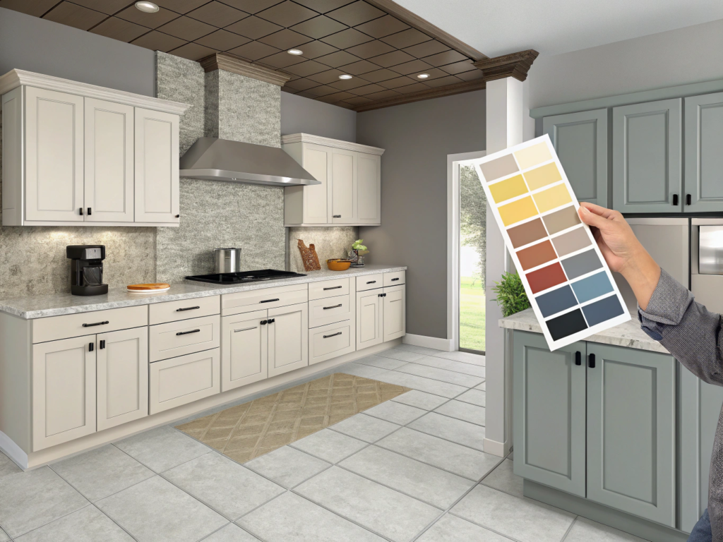
I get it, sample testing feels like a detour. But trust me, the white that looked perfect online might look like a sad sock in your actual kitchen. Paint colors are sneaky. Light, shadows, flooring, and even your toaster can mess with them.
Here’s how to test your favorites the Maya way, quick, low-drama, and actually helpful.
Step 1: Narrow It Down to 2–3 Contenders
Don’t bring home 14 swatches and expect clarity. Pick your top two or three whites based on:
- Lighting conditions in your kitchen
- Countertop and floor color
- Your “vibe” (crisp? cozy? vintage?)
Trust your gut. If one swatch makes you smile and the other makes you squint, go with the smile.
Step 2: Use Peel-and-Stick or Sample Pots
- Peel-and-Stick Swatches: Fast, clean, and movable. Great for renters or clean freaks.
- Sample Paint Pots: Messier but more accurate, especially for sheen and texture.
Either way, test a large enough patch. Tiny swatches are liars.
Step 3: Test in Multiple Spots, Multiple Times
White paint changes. What looks perfect at 10 AM may feel off at dinner.
Where to swatch:
- Upper and lower cabinets
- Near windows and away from them
- Beside countertops, flooring, and backsplash
When to check:
- Morning, afternoon, evening
- With kitchen lights on and off
- On cloudy days and sunny ones
Pro tip: Snap pics at different times of the day. You’ll notice things your eyes miss in real time.
Step 4: Live With It (Briefly)
Give it 2–3 days. Let your eyes and your space adjust. If you’re still feeling good about it every time you walk in with coffee or cook dinner, winner.
If you start noticing weird undertones or it clash with your cabinet hardware? You’ve dodged a very expensive bullet.
Do I need to test the sheen, too, or just color?
Yes, test sheen! Cabinet paints come in satin, semi-gloss, and gloss; you’d be surprised how much it changes the look. A color that feels fresh in satin might feel harsh in high gloss.
questions
What shade of white is most popular for kitchen cabinets?
White Dove by Benjamin Moore is hands-down one of the most popular choices. It’s warm-neutral, plays nicely with nearly any lighting, and feels soft without leaning yellow or gray. It’s the white I reach for when I want safe but stylish.
What is the best color for a kitchen with white cabinets?
Soft grays, greige (like Edgecomb Gray), muted blues, or even warm taupes complement white cabinets beautifully. I love pairing Simply White cabinets with a gentle green-gray wall—it adds just enough contrast without stealing the show.
What is the most popular color to paint kitchen cabinets?
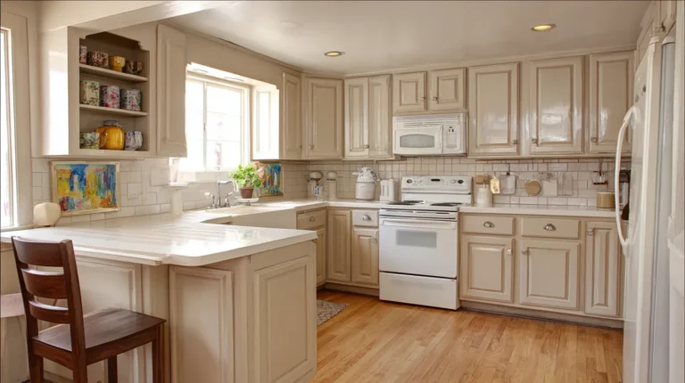
White still reigns supreme, especially for creating a bright, timeless kitchen. But within “white,” there’s variety, Alabaster, Pure White, and Chantilly Lace top the list. People love them because they’re clean and neutral, and work with any style.
What is the best warm white for kitchen cabinets?
Alabaster by Sherwin-Williams is my warm white ride-or-die. It’s cozy, soft, and never veers yellow. It’s the kind of color that makes your kitchen feel lived-in and welcoming without looking dated.
Conclusion, Pick Your White, Trust Your Gut
Here’s the thing about choosing the best white paint color for kitchen cabinets: it’s not really about finding the perfect shade. It’s about finding your white, the one that makes your space feel brighter, cozier, cleaner, calmer… whatever “right” means to you.
You don’t need to have a design degree. You don’t need to know what “LRV” meant before this article. You just need a little time, a few swatches, and the confidence to trust your own eyes.
Whether you’re drawn to the creamy calm of Alabaster, the bright clarity of Chantilly Lace, or the balanced glow of White Dove, the magic is in the testing, the choosing, and the way your space feels when it’s done.
So here’s my encouragement: Grab two paint samples this weekend. Stick them up. Watch how your kitchen reacts to them. Let your gut weigh in.
You’ve got this. And if all else fails? There’s always primer.