
Best Modern Kitchen Cabinet Colors 2025
Last week, I stood in my kitchen holding a paint swatch called “Moss Whisper,” wondering why it suddenly looked like guacamole under our lights. My toddler had just added fingerprints to a drawer I hadn’t even painted yet, and I caught myself thinking, Maybe beige wasn’t so bad after all.
If you’ve ever second-guessed a cabinet color (or six), you’re not alone. Choosing the right kitchen cabinet colors can feel weirdly emotional; it’s not just paint, it’s how your kitchen feels at 7 a.m. on a Monday or during late-night pasta sessions.
This isn’t about trends or designer jargon. It’s about what works in real homes, with messy kids, weird lighting, and budgets that don’t include custom cabinetry. So if you’re ready to find a cabinet color that doesn’t make you cringe in daylight, let’s figure it out together
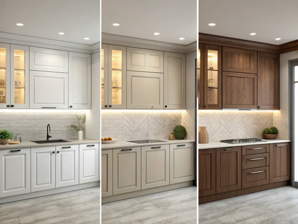
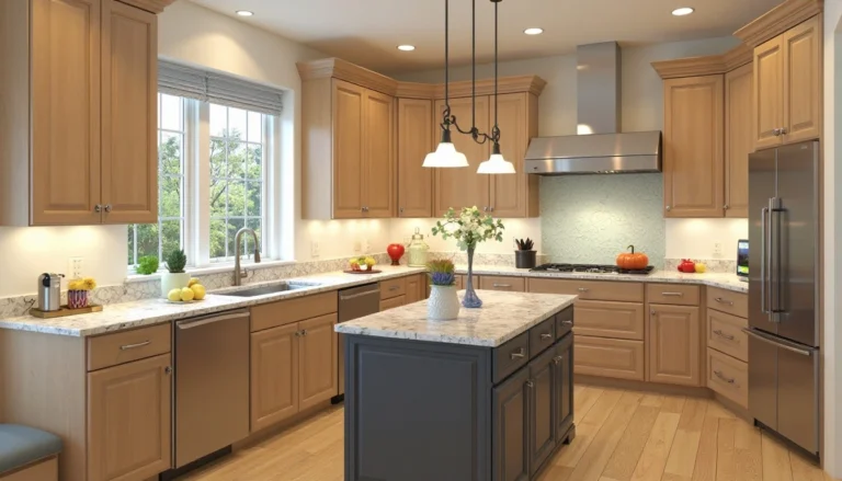
The best kitchen cabinet colors for 2025 combine timeless warmth with practical charm. Homeowners are leaning toward sage green, soft cream, dusty blue, and warm beige for their ability to blend with real-life lighting, floors, and appliances. These colors offer a cozy, lived-in feel while remaining easy to maintain and update, perfect for modern, functional kitchens.
Why Kitchen Cabinet Color Matters More Than You Think
Here’s something I didn’t fully realize until my second kitchen repaint: your cabinet color quietly controls the whole vibe of your space. It’s not flashy like a backsplash or moody like pendant lighting, it just… sets the tone. Subtly. Constantly. And when it’s off, you feel it.
I once painted our cabinets a beautiful slate blue that looked amazing in daylight, for about an hour. The moment the sun shifted (or the overhead lights came on), it turned into a kind of stormy gray that made the whole kitchen feel cold. I started avoiding the room after dinner. Not on purpose, it just didn’t feel cozy anymore. Color does that.
And it’s not just about the mood. The right kitchen cabinet color can make a small space feel bigger, a dated kitchen feel fresh, or a chaotic corner feel intentional. The wrong one? Let’s just say I’ve painted over “Trendy Taupe” twice, and I still flinch when I see beige paint swatches.
Real Talk: It’s Not Just Aesthetic
Most homeowners (myself included) pick a color based on how it looks in someone else’s kitchen. But kitchens aren’t one-size-fits-all. Your lighting, your flooring, even the color of your coffee machine, can throw everything off. A crisp white in one house might look dingy in another. A bold green might sing… or scream.
That’s why choosing a cabinet color matters so much. It’s a backdrop for your life, meals, mornings, and messes. It should support your style, not fight it.
What Makes a Color Work in a Kitchen?
-
It matches your lighting (natural vs. artificial)
-
It pairs well with existing features (counters, flooring, appliances)
-
It hides or celebrates wear and tear
-
It makes you feel good every time you walk in
Can Cabinet Color Affect Home Value?
Q: I’ve heard that cabinet color can impact resale value, true?
A: Yes, but with a twist. Neutral colors like white, beige, or soft greens tend to appeal to more buyers. But what really boosts value is a kitchen that looks cohesive and cared-for. So pick a color that feels timeless for your space, not just trendy. If you love it and it fits your kitchen, buyers will likely love the vibe too
Top Kitchen Cabinet Color Trends for 2025 That I Tried
I’ll admit it: I’ve fallen for the “color of the year” more than once, and once, it ended with me repainting a whole set of uppers after two weeks because the trendy mustard tone clashed with literally everything. But 2025? It’s looking better. Warmer. More lived-in. Less Pinterest-perfect and more… real.
So, here are the kitchen cabinet color trends that not only look great in designer homes but can work in your everyday, crumb-under-the-toaster, real-life kitchen.
Earthy Greens & Dusty Blues Still Going Strong
You’d think sage green would’ve peaked by now, but nope. It remains popular because it complements warm metals, wood tones, and natural light well. I tested “Thyme Leaf” on our island, and it made our butcher-block counter feel fancier than it is—like it belonged in a cooking show kitchen, reminding me why green kitchen cabinets continue to be such a timeless choice
Same with muted blues, like the dusty cornflower one my friend Linda used on her bottom cabinets. She paired it with white uppers and copper pulls, and it’s a perfect example of how blue kitchen cabinets can feel both soothing and interesting at the same time.
.
-
Best for: bright kitchens, wood accents, or when you want calm without going full gray
-
Works with: brass, walnut, off-white walls
Deep Moody Shades For Drama Without the Mess
If you’ve got good lighting, hear me out: go dark. Think navy, charcoal, even that inky forest green that looks black until the sun hits it just right. I painted one bank of lower cabinets in “Basilisk” (who names these, seriously?), and it gave the space this moody depth that made our cheap tile look intentional. Sort of.
-
Best for: modern, bold looks; large spaces with natural light
-
Watch out for: low-light rooms where dark colors can feel too heavy
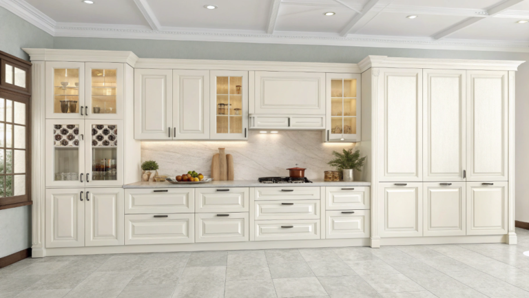
Warm Neutrals & Soft Creams Goodbye, Sterile White
White kitchens aren’t gone, but the sterile, all-white-everything look? That’s fading. Cream kitchen cabinets, along with beiges and soft greiges, are the new go-to because they add warmth without making the room feel dated.
My current cabinets are painted in “Butter Mellow, yes, really, and under both warm and cool light, they hold their own. It feels cozy without being “old beige.” My husband, who thought beige was boring, actually said it made the space feel cleaner. I’ll take that.
-
Best for: small kitchens, resale value, timeless style
-
Works with: black hardware, wood floors, colorful backsplashes
Unexpected Pops: Mustard, Blush, and Rust Yes, Really
Now, this one’s for the brave souls. I have a neighbor who did her uppers in a pale blush and lowers in deep terracotta, and it somehow works. Would I try it? Maybe on a single drawer. But these warm, retro-inspired tones are creeping into 2025 in small doses, especially on islands or inside cabinet nooks.
-
Best for: statement islands, open shelving backs, or a single bank of drawers
-
Pro tip: test it on a sample board next to your lighting and countertop first
Should I Avoid Trends Altogether?
Q: If trends keep changing, should I just stick to white or gray?
A: Only if white or gray excites you. Trends are fun to explore, not rules to obey. If that pale green makes your whole kitchen feel fresh and joyful? Go for it. If “safe” feels sterile, trust your gut. Worst-case? You repaint in a year. (Been there.)
Two-Tone Kitchen Cabinet Colors, Mixing It Up Without Losing Your Mind
Let me tell you about the time I tried two-tone cabinets with zero plan. I thought, “Light uppers, dark lowers, easy, right?” Wrong. I didn’t realize until after painting that the creamy white I used on top looked kind of yellow next to the new dark gray base. My husband walked in and asked if I’d painted them with two different brands. I wish.
Here’s the lesson: two tone kitchen cabinet colors can be amazing… if you plan ahead. And 2025? It’s basically the year of the mix, mix your colors, mix your textures, even mix a little wood in there if you’re feeling brave.
Classic Combo: Light on Top, Depth on the Bottom
Still, the safest bet. Pale uppers like off-white, cream, or pale gray make the room feel open, while darker lowers (deep blue, charcoal, rich green ground everything. It’s basically contouring for your kitchen.
-
Maya’s Pick: “Porch Light” on top and “Midnight Denim” below
-
Bonus Tip: Make sure your countertop doesn’t clash with the base, mine did, and I still regret it
Painted + Natural Wood? Surprisingly Stylish
A neighbor of mine (hi Linda!) kept her island in natural oak while painting the rest a sage green. I thought she was nuts until I saw it finished. That combo added warmth without making the space feel like a cabin. Wood brings texture and contrast to solid paint colors, especially if the grain has personality.
-
Try: walnut lowers with cream uppers, or a wood island with muted green walls
-
Works best with: simple hardware and matte finishes
A Pop of Contrast, But Just One Spot
If the idea of two-tone makes you sweat, try it in one place: the island. Or even the pantry cabinet. One punch of bold color in a sea of neutral feels fresh without the commitment of a full kitchen repaint. I once painted just our coffee bar area a dusty red (I know), and even my mother-in-law noticed, in a good way.
Do Two-Tone Cabinets Hurt Resale?
Q: Will buyers think my two-tone kitchen is too much?
A: Not if it’s done well. Stick with timeless shades, cream, navy, warm wood, and avoid jarring color jumps. A well-balanced two-tone layout can actually help your kitchen stand out, in a good, lived-in, “this-was-thought-through” kind of way
Choosing the Right Finish for Kitchen Cabinet Colors: Matte, Satin, or Glossy?
Okay, quick confession: the first time I painted cabinets, I picked a finish based on the name. “Velvet Flat”? Yes, please. Spoiler: it looked gorgeous… for a day. Then the fingerprints started. Then the grease smudges. Then my three-year-old sneezed near the pantry door and left a mystery streak I couldn’t clean without stripping the paint.
Turns out, the finish you choose for your kitchen cabinet color matters just as much as the shade itself, especially if your kitchen is anything like mine (busy, messy, and snack-filled 90% of the time).
Matte: Chic But High-Maintenance
Matte finishes look soft and sophisticated. No shine, no glare. But, and this is a big but, they’re basically magnets for every fingerprint, oil spot, and splash. If you’re the kind of person who cooks a lot or has tiny helpers (or even just one curious dog), proceed with caution.
-
Best for: low-traffic cabinets, upper cabinets, kitchens with great ventilation
-
Not-so-great for: the trash drawer or anything below toddler height
Satin a.k.a. Eggshell: My Goldilocks Pick
If finishes were jeans, satin would be that perfect pair of broken-in mom jeans, comfy, forgiving, and flattering in most lights. It has just enough sheen to be wipeable but not so much that your cabinets scream “glossy rental unit.”
I used satin on our latest kitchen in a warm cream tone, and six months in? Still love it. Still cleans up with a soapy rag. Still hides the chaos.
-
Best for: most kitchens, most lifestyles, most people who live in reality
-
Extra tip: test how it reflects your lighting, satin changes a little depending on how your bulbs hit it
Semi-Gloss & Gloss: The Wipe-Clean Dream With a Catch
If durability is your main concern, like if your kitchen sees serious action or you’ve got kids who think cabinet doors are hand towels, semi-gloss might be your best friend. It’s also great for darker colors that you want to pop.
But be warned: too much shine can look dated or plastic-y in the wrong space. And it will show every brushstroke if you’re not using a sprayer.
-
Best for: lower cabinets, high-use zones, anything near the stove or sink
-
Just don’t: pair it with super high-glare lighting unless you love drama
Can I Mix Finishes in One Kitchen?
Q: Is it okay to use satin on the top and gloss on the bottom?
A: Technically, yes, especially if you want durability where it counts. I’ve done satin uppers and semi-gloss lowers, and no one noticed except my neighbor Sarah, who notices everything. Just keep your color consistent, and the finish difference will feel intentional
Choosing Hardware for Your Kitchen Cabinet Colors Without the Regret
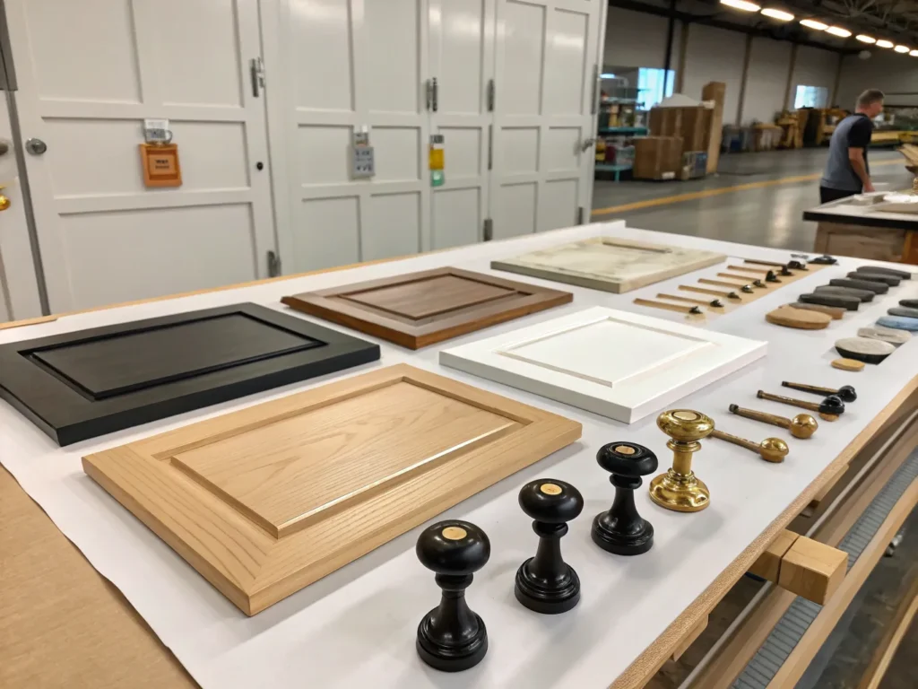
I stood in aisle 14 of Lowe’s for almost an hour trying to decide between two drawer pulls, both black, both matte, both $4.39 each. The difference? One had a curve that felt “fancy,” and one looked like something out of a grandma’s bathroom. I picked the fancy one. Got home. Hated it.
Turns out, hardware isn’t just an afterthought. It changes how your kitchen cabinet color looks. It shifts the mood of the whole room. And if you’re indecisive (hi, welcome), it can make you want to cry into your cabinet doors.
So here’s what actually helped me, not what the design blogs said, but what I learned from returning way too many knobs.
Match the Feeling, Not the Finish
You don’t have to match your hardware to your faucet or your appliances (unless you want to). What matters more is whether the metal feels right with your cabinet color. My cream cabinets looked too sweet with shiny chrome, like I was decorating a dollhouse. But once I switched to soft brushed brass? Instant grown-up warmth.
Try this test: hold a sample handle next to your painted cabinet in both natural and overhead light. If it feels like they belong at the same party, you’re good.
Black Works With More Than You Think
I was scared of matte black for a while, thought it would look too modern or harsh. But once I used it on dusty green cabinets, something clicked. It grounded the whole space. And it hides smudges like a champ. (Which is important when your kid eats peanut butter straight from the spoon. Don’t ask.)
Black also looks great with navy, pale blue, or even warm gray, especially if you’ve got wood elements nearby.
Wood? Yes. Really.
This one surprised me. I saw a photo online of oak knobs on green cabinets and thought it looked weird. Then I tried a sample in person, and it added the softest texture. Like it belonged in a cozy cabin kitchen, but still modern.
If you’re using wood hardware, keep the shapes simple, and make sure it doesn’t fight with your flooring. (I once accidentally matched my drawer pulls to our baseboards and now I can’t unsee it.)
Do I Really Need to Spend $5 Per Handle?
Q: I’m on a tight budget — is it okay to buy the cheaper multipacks?
A: Absolutely. I’ve used $1.99 handles from Amazon and loved them. Just read the reviews, check the screw length (ask me why I now own 27 screws that fit nothing), and order one pack to test before committing. And hey, if you change your mind later, you’re only out a few bucks
How I Finally Picked a Kitchen Cabinet Color That Didn’t Drive Me Nuts
I didn’t think I was a “color waffler” until I spent three nights staring at taped-up paint swatches like they were crime scene evidence. My husband stopped asking what I was doing. The kids just started calling one of the colors “sad blueberry.” (That one didn’t make the cut.)
I’m telling you this because I get it, standing in your kitchen thinking, Why is this so hard? You’re not being picky. It’s just that kitchen cabinet colors don’t exist in a vacuum. They exist next to that tile you regret choosing in 2017, and that fridge that kind of sticks out too far.
Here’s what finally helped me make a choice I didn’t want to undo a month later.
First: Forget Trends
The color I almost chose was on four “Top Colors for 2025” lists. And it made my kitchen feel like a waiting room. What looked earthy online looked sad next to my maple floor. It’s okay to skip the trend and go with something that actually feels right under your lights, in your space.
Second: Watch How It Changes
Paint is weird. I had a color that looked perfect in morning light and then turned slightly greenish by dinnertime. Not in a fun way. More like, “Is this mold?” You have to live with it for a few days, cook, do dishes, and run the overhead light. I wrote notes. Like a scientist. A tired, over-caffeinated scientist with paint on her elbow.
Third: Don’t Go Too Light If You Cook Like I Do
One of my samples was almost white. Gorgeous on the chip. But one spaghetti night, and I knew it’d be a disaster. Unless you love wiping splashes, stick to something that forgives your life a little.
I’m Down to Two Colors. Now What?
Q: Should I flip a coin?
A: Honestly? Maybe. But here’s what worked for me: I painted one door each color. I didn’t label them. I just lived with both for a week. And one day I looked at them and thought, Yeah. You’re the one. (It was called “Basil Cream,” if you’re curious. Weird name. Good vibe.
Kitchen Cabinet Colors to Avoid in 2025: Yes, I’ve Made These Mistakes
Let’s just say there are a few colors I painted… and then unpainted. And yes, one of them involved a gray that made my kitchen feel like a hospital breakroom. I still get flashbacks when I open the junk drawer.
Trends change, but some cabinet colors seem to hit a wall in real homes. Here are the ones I’d personally skip in 2025, not because the internet said so, but because I’ve lived with them, and they were kind of a bummer.
The All-White Overload
White cabinets aren’t canceled, but all-white-everything? It’s starting to feel cold, sterile, and honestly, kind of high-maintenance. I painted ours a bright white once; it looked stunning for exactly one week. Then the smudges started. Then the weird shadows. Then my daughter wiped peanut butter on the pantry and I still can’t get the stain out.
If you love white, try an off-white or creamier tone. It softens the space and feels way more forgiving.
Gray, That’s Too… Gray
There’s a certain mid-tone gray that used to be everywhere. You know the one, not quite warm, not quite cool, and kind of sad in cloudy weather. It doesn’t play nice with beige counters or yellow-toned floors, and yet we all tried it..
I had a shade called River Fog, yes, really. It made my oak floor look orange and gave me mild seasonal depression. Lesson learned: always test your gray kitchen cabinets carefully before committing
Super Bold Trend Colors (You’ll Regret By Next Year)
In 2022, I went through a mustard phase. I still have the can of paint. I keep it as a reminder.
Look, bold can be beautiful. But unless you’re 100% sure you want navy lowers or a deep plum island, maybe try it on a smaller piece first. I once tested a trendy burnt orange on a single drawer. My husband said it looked like a traffic cone. He wasn’t wrong.
Should I Avoid Black Cabinets?
Q: I’ve seen black kitchens on Instagram. Are they outdated?
A: Not necessarily. But full-on matte black everywhere? Tough to pull off unless you have tons of light and really minimal everything else. I tried black on one set of lowers and loved it, until our dog rubbed up against them and left a streak I couldn’t unsee. Black shows everything. Proceed with caution (and a microfiber cloth
Real Kitchen Cabinet Color Inspiration from Actual Homes, Not Just Pinterest
Let’s be honest, most of those Pinterest kitchens don’t have toddlers, mismatched appliances, or 4 PM shadows that make your carefully chosen beige look vaguely green. That’s why I’ve started paying more attention to real kitchens. You know, like my friend Linda’s, who painted her island a shade that matched her dog’s collar (unintentional, but adorable).
Here are a few cabinet color combos I’ve seen in actual houses, and spoiler: they’re way more helpful than magazine spreads.
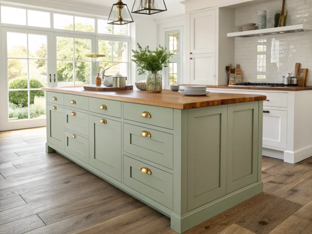
1. Sage Green + Oak = Instant Calm
My neighbor Sarah has this magical little kitchen where the upper cabinets are sage and the lowers are warm oak. I thought it would feel mismatched. It doesn’t. It feels like tea and fresh bread and calm mornings. (Even though I know her kids fight over cereal just like mine.)
Why it works: Sage brings a cool, soft energy. The oak warms it up. Together, they balance each other in that perfect, no-effort way that’s hard to fake.
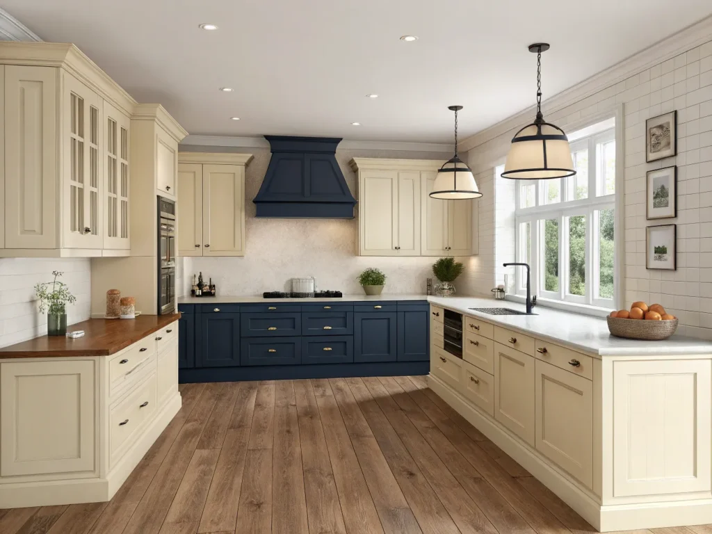
2. Cream + Deep Blue = Drama Without the Fuss
Okay, this one surprised me. A family down the block redid their galley kitchen with creamy upper cabinets and rich blue lowers. Not navy. Not teal. More like blueberry skin, moody but not gloomy. With gold knobs, it looked intentional, even though they confessed they picked the blue on a dare.
Why it works: Cream keeps it open. Blue adds depth. And somehow the whole room feels taller.
3.Soft Beige + Painted Brick = Cozy, Modern Cottage
One of my favorite looks was in a rental I saw on Facebook Marketplace (yes, I creep those listings for inspo). The cabinets were a pale mushroom color, and the walls had a dusty red painted brick. It shouldn’t have worked, but it did. Probably because everything was matte and quiet.
Why it works: beige kitchen cabinets get a bad rap, but in the right tone and texture, they feel lived-in, not forgotten
What If My Kitchen Isn’t Inspiring?
Q: My kitchen is small, dark, and has zero fancy features. Can I still do something interesting with color?
A: Absolutely. Some of the best cabinet color choices I’ve seen were in tiny, quirky kitchens. The key is to pick one detail, like a cozy green or warm clay tone, and let it do the work. You don’t need marble or open shelving. Just a color that makes the room feel more yours
How to Test Kitchen Cabinet Colors Before You Regret Everything
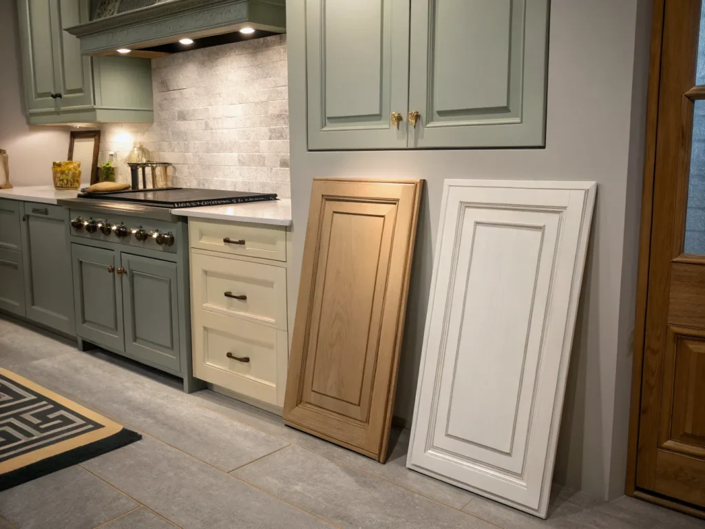
Look, I’ve made enough color mistakes to know that a paint swatch is not a promise, it’s a suggestion. One that will absolutely betray you if you don’t test it right. I once picked a dreamy soft yellow that turned full-on buttercup in our kitchen lighting. It looked like I was hosting a preschool art class in there. For months.
So before you grab a roller and go all-in, here’s how to test kitchen cabinet colors in real-life, not showroom conditions.
Don’t Just Paint the Wall, Use a Cabinet Door
I used to paint sample squares on the wall. Then I realized my walls and cabinet material absorb color differently. Now I grab an old cabinet door (or even foam board) and slap a big patch of paint on it. That way I can move it around the kitchen, see it next to the stove, near the window, under that one bulb that flickers when the toaster’s on.
-
Bonus: you can do this with cardboard too, but be prepared for warping if you layer it thick (learned that the soggy way)
Check It at Weird Times
It’s not just about daylight. Your cabinets live through breakfast shadows, evening meal-prep glow, and that “why am I snacking at 10:37 pm? mood lighting. Some colors get weird at night. Others turn sad under the overheads.
My rule now? Look at your sample morning, noon, and post-dishwasher steam. One of those will surprise you. Probably not in a good way.
Test Next to Counters, Floors, and Appliances
I once chose a gorgeous olive tone that looked amazing next to my backsplash. Then I noticed it made our white fridge look… yellowish. And not soft, buttery yellow, I mean, expired cream cheese yellow. It was not the vibe.
So always test your color near everything permanent. Even the stuff you wish you could replace but can’t yet.
Can’t I Just Trust the Sample Card?
Q: Paint companies show examples, can’t I just pick one of those?
A: I mean, you can. But just know those example kitchens are professionally lit, staged, and filtered within an inch of their lives. What looks like “Stone Mist” online might read “wet sidewalk” in your house. Always test in your space, with your weird shadows and spaghetti sauce splashes
Final Tips: Balancing Cabinet Color Trends with What Feels Like You
Let me say this loud for the folks in the back (and for past me): you don’t have to pick the right kitchen cabinet color, you just have to pick one that makes you like your kitchen a little more. That’s it.
Trends will shift. Designers will hype “moody burgundy” one year and call it dated the next. But your cabinets? They’re part of your life, the snack raids, the late-night tea, the messy birthday cupcakes.
If you’ve followed this far, you already know the real stuff matters more than perfection. So here are my final, hard-earned truths:
Trust What You Keep Coming Back To
If you’re still thinking about that soft green you saw six paint samples ago? That’s a clue. You’re allowed to want warmth. You’re allowed to want joy. You’re even allowed to want taupe if it calms your brain.
It’s Okay to Change Your Mind
I repainted our lowers two months after “finishing” the kitchen. Not because they were ugly, just because they didn’t feel like us. And when I finally got the color right? I started baking more. Coincidence? Probably. But it felt good.
Don’t Wait for the Perfect Time
Budget tight? Start with one section. Hate commitment? Paint a drawer. Need validation? Text me a photo, I’ll hype you up. (Okay, not literally, but imagine I’m doing it anyway.
Because your kitchen doesn’t need to be perfect. It just needs to feel like home, fingerprints and all.
Useful Resources
- Browse ready-made kitchen cabinet colors on Amazon
- Compare kitchen cabinet colors and styles on Lowe’s

Nice answers in return of this matter with firm arguments and telling everything concerning that.
I used to be able to find good advice from your blog articles.
One other thing I would like to talk about is that instead of trying to match all your online degree classes on days of the week that you finish off work (because most people are fatigued when they get home), try to obtain most of your sessions on the saturdays and sundays and only a few courses for weekdays, even if it means taking some time off your weekend. This is fantastic because on the week-ends, you will be much more rested along with concentrated for school work. Thanks for the different recommendations I have discovered from your blog.