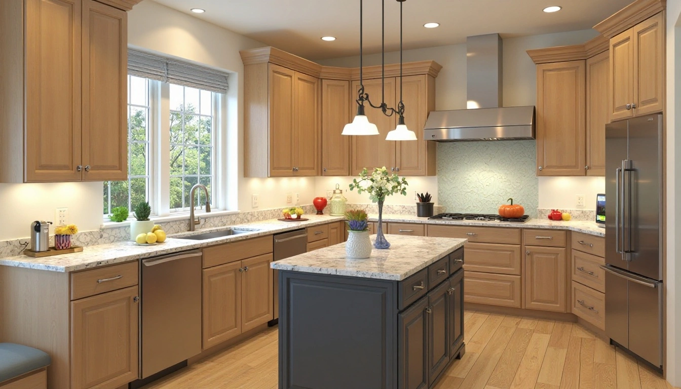
Kitchen Colors with Light Brown Cabinets Expert Picks
Ever walk into your kitchen and feel like something’s just… missing? Maybe it’s not the layout or the lighting, maybe it’s the color you’ve paired with those light brown cabinets.
Here’s the thing: light brown cabinetry walks a fine line. It’s cozy, yes, but too much brown, and the space can start to feel a bit… uninspired. Too much contrast, and it might clash. That’s why choosing the right kitchen colors with light brown cabinets can quietly transform everything, from the mood to the perceived space to how clean your kitchen feels.
Whether your cabinets are natural oak, a sandy maple stain, or painted in a subtle tan, you’re in the right place. This guide unpacks the best wall colors, backsplash combinations, and accent ideas to enhance (not fight against) those light brown tones. We’ll also help you understand undertones, lighting effects, and what works best in real homes, not just Pinterest-perfect ones.
Because let’s be honest: you don’t need a full remodel. You just need the right color to make everything click.
How to Match Kitchen Colors with Light Brown Cabinets

Let’s slow down for a second, because before we start picking out dreamy wall colors, we’ve got to talk about what kind of light brown cabinets you actually have.
And I don’t mean just “wood” or “brown.” I mean… what’s the story behind those cabinets? Are they the original 80s oak with a yellow glow? A newer maple that leans more sandy than honey? Or maybe something faux that’s trying really hard to pass as wood but keeps fooling no one?
Why it matter? Because every light brown has a personality. Some run warm, think golden, reddish, or even orange-y tones. Others sit on the cool side, with gray or taupe undertones that feel a bit more modern (but can also come off cold if you’re not careful).
How to Spot Undertones (Without Losing Your Mind)
Here’s a trick I used in my grandma’s kitchen: Grab a sheet of white printer paper and hold it up against the cabinet door. Suddenly, the true tone pops out. That once “brown” cabinet now shows its orangey side, or maybe it surprises you with a subtle pink hue.
Why care? Because paint colors don’t exist in a vacuum. A soft gray might look crisp in one kitchen and muddy in another, all thanks to those sneaky undertones. Matching them means your space feels cohesive, not like two ideas fighting for the same square footage.
Finish & Texture Matter, Too
Are your cabinets glossy or matte? Smooth or woodgrain-heavy? These things affect how color bounces around your kitchen.
-
Glossy, flat-front cabinets reflect more light — so darker wall colors might feel bolder.
-
Grainy, rustic woods soak in that light, making even brighter walls seem subdued.
BTW: I once chose a warm cream paint for a set of light pine cabinets… and it looked straight-up yellow under my kitchen’s lighting. That’s when I learned: always test your swatches in real lighting.
How Do I Know If My Cabinets Are Warm or Cool?
Q: I can’t tell if my cabinets are warm-toned or cool-toned. Help?
A: Try comparing your cabinet color to items with known tones, like a bright white (cool) vs an ivory or cream (warm). Warm cabinets tend to look better next to earthy colors (like terracotta or olive), while cool cabinets pair better with blues and grays. If it still feels confusing, take a photo in natural light and play around with a digital color picker — you’ll often spot undertones faster that way.
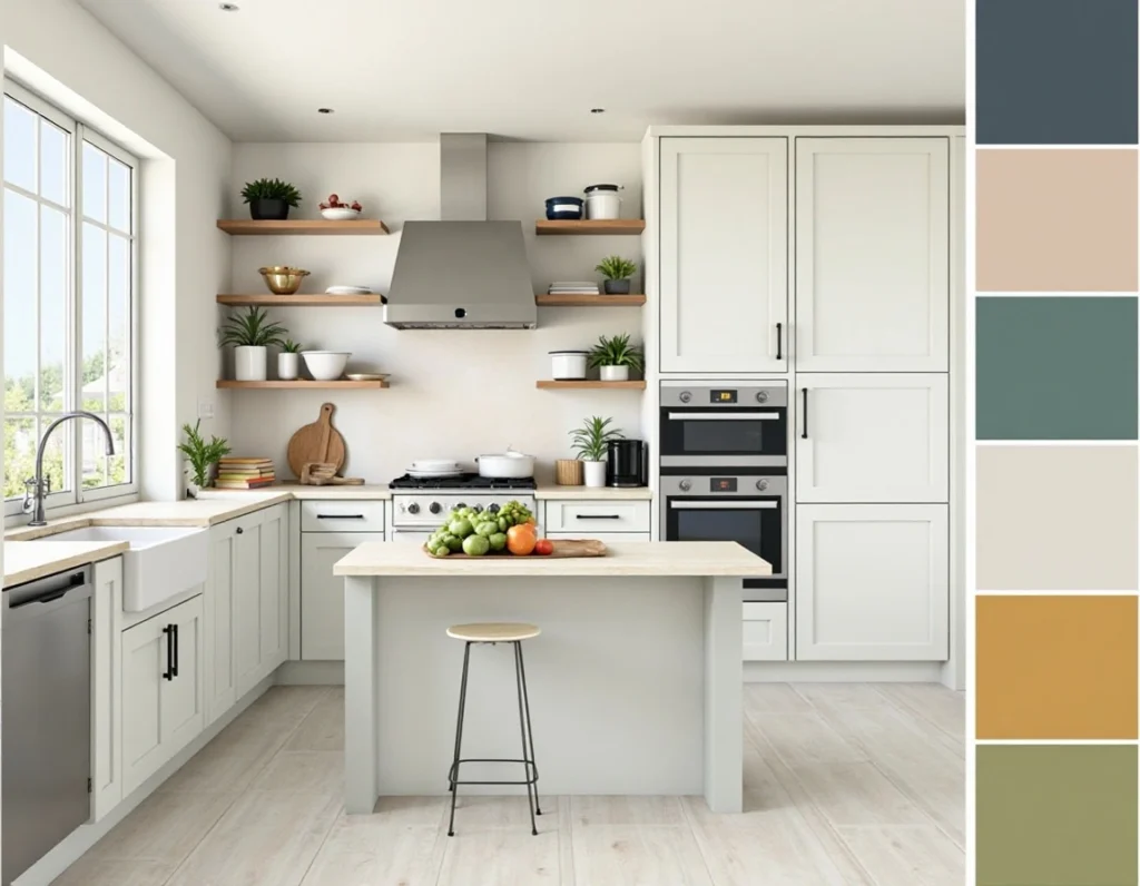
Best Neutral Kitchen Colors for Light Brown Cabinets
Let’s be real, when you’ve got light brown cabinets, picking a neutral wall color sounds easy… until you’re ten paint samples deep, squinting under your kitchen light like you’re solving a mystery. I’ve been there. “Just pick a white!” they say. But wow, who knew white could come in so many personalities?
Here’s what I’ve learned: not all neutrals are created equal. And with light brown cabinets, it’s less about matching and more about balancing. These shades don’t shout, they whisper. And sometimes, that’s exactly what a kitchen needs.
1. Soft White – Not the Sterile Kind
Soft white is like the cozy sweater of paint colors. It’s clean but has just enough warmth to keep things from feeling… dental. Think “linen,” not “light bulb.”
-
Feels open and bright without going stark.
-
Pairs beautifully with warm woods like maple or oak.
-
Let your decor (backsplash, art, even dish towels) shine.
Confession: I once used pure white on my kitchen walls. Loved it in theory, hated how every single smudge glared at me like, “Hi, yes, we live here too.”
2. Cream or Warm Beige – Match Made in Undertone Heaven
You know those kitchens that feel instantly together? Like everything just clicks? That’s usually because they played with tone-on-tone warmth. Cream walls next to light brown cabinets can give that soft, cohesive vibe without veering into matchy-matchy.
-
Ideal if your cabinets have golden or reddish notes.
-
Adds subtle depth while keeping the space calm.
-
Bonus: It’s forgiving. Smudges and fingerprints disappear better on bright walls.
My go-to? “Swiss Coffee” (Behr) or “Accessible Beige” (SW). Both looked meh in the can — and magic once dry.
3. Gentle Gray – A Cool Companion (Sometimes)
Gray can be a hero or a heartbreaker. Used right, it cools down a warm kitchen just enough. But the key? Stick to soft, grayish grays, nothing icy.
-
Works wonders with ashy brown or taupe cabinetry.
-
Gives a grounded, modern touch.
-
Looks especially sharp with black hardware or brushed steel.
If your cabinets lean too yellow-orange, though? Gray might make things muddy. (Ask me about the week I spent repainting an entire wall because “Silver Drop” turned my kitchen into a sad latte.)
Should I Paint My Kitchen White If I Have Light Brown Cabinets?
Q Will white walls look too harsh with warm-toned wood?
A Depends on the white. Anything labeled “bright,” “ultra,” or “cool” might clash hard with warm cabinets. Look for terms like “creamy,” “soft,” or “antique” in the paint name. And always test next to your cabinet — in morning and evening light. Trust me, paint plays tricks.
Calming Blues & Greens Soft Cool Tones That Just Work

So here’s the thing I didn’t get at first: sometimes, the best way to warm up a kitchen isn’t with more warmth. It’s by pulling in a bit of cool. I know, it sounds counterintuitive, especially when you’re staring at those honey-toned cabinets wondering, “Shouldn’t I go with beige?” But the magic happens when you bring in soft blues or greens. Not bold, not beachy, just… calming.
They don’t fight the brown. They balance it. It’s like background music that shifts the whole mood of the room without anyone noticing why.
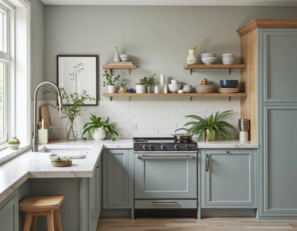
1. Sage Green – Subtle, Soft, and Always Right
There’s a reason sage shows up in so many Pinterest kitchens — it’s basically the denim of wall colors. Goes with everything, never feels try-hard, and somehow makes the whole space feel intentional.
-
Blends beautifully with natural wood, especially oak or pine.
-
Adds a touch of nature without looking too rustic.
-
Works in both bright and dim kitchens — it just adjusts.
I used sage in my cousin’s rental makeover, mostly because it was the only leftover paint we had. Not kidding — it looked so polished, the landlord thought we’d hired a pro. We hadn’t. We had pizza and painter’s tape.
2. Dusty Blue – Quietly Cool (But Not Cold)
Dusty blue is the color equivalent of an exhale. Not bold. Not icy. Just… calm. It brings down the warmth of your cabinets without dulling them, especially if you’ve got a bit too much yellow or orange going on.
-
Looks amazing in sunlit kitchens — it softens everything.
-
Plays well with white trim, open shelving, and even stainless steel.
-
Doesn’t scream “blue,” which makes it surprisingly flexible.
True talk: I planned to use this shade on an accent wall and chickened out because I thought it might be “too much.” Six months later, I saw it in someone else’s kitchen and instantly regretted it. Live and learn.
3. Teal as an Accent – Just Enough Drama
Now, if you’re feeling a little adventurous — like not “black wall” bold, but still want something with presence — teal is your friend. Deep, rich teal. Not turquoise, not neon. The kind that makes light brown wood feel high-end.
-
Killer in open shelving nooks, behind bar stools, or in art.
-
Adds depth without making the room feel closed in.
-
Brings out natural warmth in the wood without clashing.
I painted the inside of a few open cabinets in a deep teal once — partly because the original finish was scratched, partly because I was curious. It made cheap dishes look expensive. Still not sure how.
Will Blue Make My Kitchen Feel Cold?
Q: I like blue, but I’m worried it’ll make my kitchen feel cold. Should I steer clear?
A: Not necessarily. It’s all about which blue. Stick with muted, gray-leaning, or green-tinged tones — the ones that feel like fog or faded denim. Avoid anything that reminds you of toothpaste or toddler pajamas. When paired with warm cabinetry, those soft blues can actually make the space feel more balanced, not less.
Warm, Inviting Accents, Cozy Wall Colors That Embrace Light Brown Cabinets

Let’s say you like your cabinets. You’re not trying to tone them down or fight their warmth — you just want the room to feel cozier, maybe even a little nostalgic. Like walking into your grandma’s kitchen… but with better lighting and fewer fake plants.
These warm, deep colors don’t just complement light brown cabinets — they lean in. They make your space feel layered, intentional, and yes, kind of like fall all year round (in the best way).
1. Terracotta – That Earthy “Designer” Warmth
Terracotta is one of those shades that doesn’t always jump out on a paint swatch — but on the wall? It glows. Especially next to honey oak or maple cabinets, it adds this grounded, earthy vibe that feels both rustic and refined.
-
Think Adobe walls, terra cotta pots, or Tuscan tiles.
-
Perfect for an accent wall behind floating shelves or over the sink.
-
Pairs beautifully with open wood beams, leather stools, or black pendant lights.
A reader once emailed me that they used Behr’s “Canyon Dusk” behind their open pantry. They were going to go beige, but the terracotta made their $12 IKEA jars look like vintage finds.
2. Mustard – Deep, Cheerful, and Super Unexpected
There’s something about mustard — not the condiment, the color — that makes a kitchen feel warm and playful. It’s richer than yellow, softer than gold, and way more stylish than people give it credit for.
-
Looks amazing against light walnut or red oak cabinets.
-
Complements white countertops and patterned backsplashes.
-
Adds a retro vibe, especially if paired with chrome or black accents.
If you’re unsure, try mustard in a smaller zone first — like around the window trim or behind the coffee station. I’ve used “Golden Plumeria” (PPG) and never looked back.
3. Rust or Burnt Orange – The Unexpected Star
Rust might sound bold, but it reads like a warm blanket on the wall. When your cabinets have a lighter, cooler tone (like ash or natural birch), burnt orange adds this touch of richness without overwhelming the space.
-
Ideal for smaller kitchens where a little drama goes a long way.
-
Gorgeous with warm white tile and dark hardware.
-
Adds serious depth to otherwise plain color schemes.
One of my favorite DIYs was a burnt orange corner behind my breakfast bench. I wasn’t even sure it would work, but now it’s the most complimented corner in the house. Go figure.
Can Warm Colors Make a Kitchen Feel Too Heavy?
Q: If my cabinets are already brown, won’t warm wall colors make the kitchen feel dark or overloaded?
A: It depends on balance. If your cabinets are light or mid-tone, warm accents can enhance the richness, not drown it. The key is texture: pair terracotta with crisp white trim, or offset mustard walls with clean metal finishes or glass. Warm-on-warm works best when each shade plays a different role, background, feature, or accent.
Dramatic & Chic Colors, For Kitchens That Want a Little Edge

Let’s say you’re not afraid of color. Or maybe you are — but you’re also tired of playing it safe. This section’s for the risk-takers (or the quietly curious), the ones who’ve pinned a dozen moody kitchens but haven’t dared to grab a sample yet.
Dark, dramatic hues don’t just work with light brown cabinets — they elevate them. The trick is all in contrast and balance. You’re not trying to drown out the wood; you’re letting it shine by surrounding it with shadows.
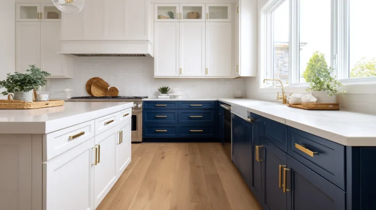
1. Navy Blue – Moody, Timeless, and Surprisingly Easy
Navy might feel bold, but it’s actually one of the most versatile deep colors out there. It’s classic without being boring, modern without being cold. Against light brown cabinets, it creates this cozy, high-end contrast that makes everything feel a little more considered.
-
Works beautifully on accent walls, islands, or even ceiling panels.
-
Looks stunning with brass or gold hardware.
-
Plays well with white counters or subway tile.
I once saw a kitchen with golden oak cabinets and navy walls, and I swear it looked like a page out of a boutique design mag. All they did was swap the paint and the light fixture.
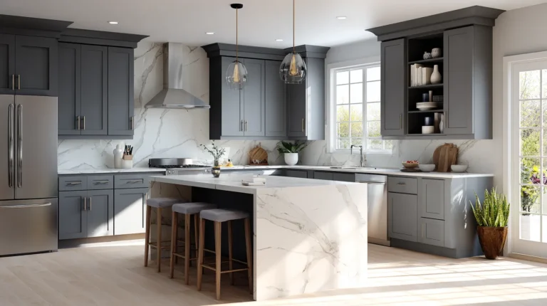
2. Charcoal or Deep Gray – Sophisticated with an Edge
If black feels too heavy but beige feels too safe, charcoal hits that middle ground. It’s dramatic but flexible — like a great pair of tailored pants. Especially if your light brown cabinets are smooth or modern, this color adds sleekness without trying too hard.
-
Perfect for modern or minimalist kitchens.
-
Adds mood without sucking out all the light.
-
Pairs nicely with light wood floors or stone countertops.
Try it on a feature wall or even just the lower half (hello, two-tone walls!). I used “Iron Ore” once and got more compliments than when I refinished the entire cabinet set. Go figure.
3. Forest Green – Bold But Not Loud
Deep green has had a major comeback, and for good reason. It’s rich, grounded, and brings a bit of the outdoors inside. Next to warm wood tones, it looks lush and cozy, almost like a cabin… but make it Pinterest.
-
Looks fantastic with butcher block, copper, or vintage pieces.
-
Ideal for cozy breakfast nooks or window walls.
-
Gives big style without looking trendy.
Pro tip: Stick to greens with gray or black undertones (not minty or emerald). That’s what keeps it grounded.
Can I Use Dark Colors in a Small Kitchen?
Q: Won’t deep colors make my small kitchen feel even smaller?
A: Not necessarily. Deep hues can actually create depth and warmth, especially if you have light cabinets and good lighting. The contrast draws the eye and makes the space feel more layered. Just balance with lighter trim, open shelving, or reflective finishes so the room doesn’t feel closed off.
Two-Tone & Layered Looks: Mix It Up Without Going Overboard

Here’s the secret nobody tells you: you don’t need to repaint your entire kitchen to make it look brand new. Sometimes, just layering in a second tone, whether through walls, islands, or even cabinet finishes, is enough to breathe fresh life into the whole space.
And with light brown cabinets? You’ve already got your base. Now it’s just about pairing it smartly.
1. Contrasting Islands, The Easiest Statement Ever
If your upper and lower cabinets are the same tone, try painting the kitchen island something deeper or cooler. Navy, charcoal, forest green, they all give that “custom kitchen” look without custom prices.
-
Light brown uppers + navy island = instant depth.
-
Try a soft black island with butcher block counters for a rustic-meets-modern look.
-
Or flip it: light island, deeper brown perimeter.
A friend of mine used a dark blue on their island to offset maple cabinets, and suddenly the whole space felt designer. They didn’t even change the hardware. Wild.
2. Painted Upper Cabinets or Open Shelves
This is for the brave souls (or the very confident DIYers). Painting just your upper cabinets a lighter or cooler tone can break up too much wood tone and make the kitchen feel taller, airier, or just… more interesting.
-
Great option if your cabinets feel “too brown.”
-
Soft white, pale green, or light gray are safe bets.
-
Pair with open shelving for an even lighter visual feel.
When I first tried this, I used a sample pot to test a dusty blue on one cabinet door, and left it there for two months just to “live with it.” Spoiler: I ended up painting the uppers that color… and never once missed the brown.
3. Layering Through Backsplash, Decor, or Even Ceilings
Two-tone doesn’t always mean paint. Think beyond the walls:
-
Use a bold patterned backsplash with colors that pull from your cabinet tone.
-
Hang darker art or shelving units above light wood.
-
Try painting the ceiling a soft neutral; it draws the eye up and adds surprise.
I once painted the ceiling in a client’s galley kitchen a pale, warm taupe. They were skeptical. Three weeks later, they said it made the kitchen feel twice as tall. (Bonus: no one sees the dust up there.)
Do Two-Tone Kitchens Look Dated?
Q: I’ve seen two-tone kitchens on Pinterest — are they going out of style?
A: Nope — if anything, they’re evolving. What is dated is when the contrast feels random or harsh (like cherry wood and bright yellow). Stick to colors that either contrast with intention or softly blend into each other. Bonus points if your lighting, backsplash, or hardware ties them together.
Beyond Paint, Texture, Finish & the Details That Matter
Here’s a little truth I wish someone told me sooner: it’s not just the wall color that makes your kitchen feel polished — it’s how everything talks to each other. The lighting, the cabinet finish, the backsplash, even the sheen of your paint… they all whisper (or shout) a vibe.
Let’s zoom in on those details that can make or break how your light brown cabinets actually feel in your space.
1. Paint Sheen – Yes, It Totally Matters
Flat, eggshell, satin, semi-gloss — it sounds like lipstick finishes, but trust me, these little differences can change everything about how a wall color looks next to your cabinets.
-
Flat or matte: Hides flaws but can look chalky next to shiny cabinets.
-
Eggshell or satin: My go-to for walls. It reflects light gently and’s easy to wipe down.
-
Semi-gloss: Best for trim or backsplashes, but use sparingly unless you want serious shine.
I once painted a kitchen in a creamy white — same color, different finishes — and one side looked high-end, the other looked like a chalkboard. I had no idea until sunlight hit at 3pm. Never again.
2. Cabinet Finish – Shiny, Matte, or In-Between?
The finish of your actual cabinets affects how colors bounce and blend.
-
Glossy cabinets reflect a lot of light, great for darker wall shades.
-
Matte or woodgrain absorbs light, perfect for pairing with warmer, richer hues.
-
Satin or semi-sheen is that nice in-between, especially good if your walls are textured.
Pro tip: Wipe your cabinets with a damp cloth before sampling new colors nearby. Dust and grease will totally throw off your read on tones.
3. Accents & Hardware – The Unexpected Color Influencers
Sometimes, it’s not the wall or the cabinet that feels off — it’s the hardware. Brushed nickel, black matte, oil-rubbed bronze, antique gold… they all carry a color temperature. And yes, they can either enhance your palette or make it feel like a mess.
-
Warm-toned hardware (brass, gold) works beautifully with rich, cozy paint.
-
Cool-toned (chrome, steel) leans modern and crisp.
-
Mixed metals? That is totally fine, as long as you repeat each one at least twice for balance.
I once swapped out six cabinet pulls in a rental, $48 total — and suddenly the cabinets felt intentional, not like hand-me-downs from 2004.
Does Paint Finish Really Change Color Appearance?
Q: If I choose eggshell vs satin, will my paint color actually look different?
A: Yep. Even if it’s the exact same color name, the finish can reflect light differently, making it feel cooler, warmer, glossier, or even slightly tinted. Always test your final choice on the finish you plan to use. Don’t assume a sample pot in flat paint will match your satin walls.
Real-World Inspiration Moodboards & Kitchen Color Combos That Actually Work
Sometimes, you don’t need more ideas — you just need to see them. That’s why this section’s all about real combinations. Not dream-home fantasy ones with $20,000 stoves and no crumbs anywhere — I’m talking color pairings from real kitchens, small renos, and trial-and-error wins (and a few fails).
Here’s what actually worked for me, friends, and readers like you.
Combo 1, Light Maple + Sage Green Walls + Matte Black Fixtures
This one’s like a gentle forest walk in kitchen form. The sage green cools the warm maple just enough, while black knobs and a black faucet give it a modern edge.
-
Add: Warm white backsplash, wood floating shelves.
-
Works well with: White quartz or butcher block counters.
-
Best lighting: East-facing kitchens (morning light makes the green glow).
A reader sent me a photo of this combo with vintage bar stools — it looked like something out of a Kinfolk magazine, but they swore it was all under $2,000.
H3: Combo 2, Honey Oak Cabinets + Dusty Blue Accent Wall + Brass Fixtures
Okay, I didn’t expect to love this one as much as I do. But there’s something about soft blue next to that golden tone that feels fresh, almost nautical without being kitschy.
-
Add: White or off-white trim, woven textures (like a jute rug).
-
Keep hardware simple and warm (brass, brushed gold).
-
Great for: Galley kitchens or one-wall layouts that need depth.
I used this in a rental redo with removable wallpaper behind the stove. Tenants loved it, and the landlord kept it when we moved out.
Combo 3, Ash Cabinets + Burnt Orange Wall + Mixed Metal Accents
Ash or taupe-toned wood can feel a little cold on its own. Add burnt orange — even just one wall — and suddenly, it’s got personality. The key is mixing finishes: black sconces, nickel drawer pulls, maybe even copper pans out on a rail.
-
Add: Cream ceiling and warm wood floors.
-
Pro tip: Use rust in open sightlines (like across from the sink) so it anchors the space.
-
Mood: Cozy dinner party, every night.
A client once told me this combo “felt like autumn, but not in a pumpkin-spice way.” I couldn’t have said it better.
Where Can I Test Kitchen Color Combos Before Painting?
Q: Is there a way to visualize these combos without painting a wall first?
A: Absolutely. Try free tools like Canva (make a moodboard), the Sherwin-Williams or Benjamin Moore visualizers, or even Pinterest’s “Try On” feature. Snap a pic of your kitchen and layer in color samples digitally — it’s not perfect, but it’ll save you from five hardware store trips.
Expert Tips for Getting It Right, Without Second-Guessing Every Swatch
If you’ve ever stood in the paint aisle for 45 minutes, holding five nearly identical color strips and silently panicking… welcome to the club. Choosing the right color combo for your light brown cabinets isn’t just about taste — it’s about lighting, undertones, finish, and yes, a little gut instinct.
Here are the tips I wish someone had told me when I was knee-deep in samples and self-doubt.
1. Test Swatches on Multiple Walls, And Wait 24 Hours
Paint looks different at 8 AM than it does at 8 PM. What feels creamy in sunlight might go full mustard under warm bulbs.
-
Test at least three spots, near the cabinets, opposite a window, and under artificial light.
-
Leave the samples up for a full day before deciding.
-
Write the name of each swatch on the wall (trust me, you’ll forget).
True story: I once fell in love with a soft taupe that looked perfect in the morning. By dinnertime, it had turned green. Not in a fun way.
2. Don’t Forget the Floor and Countertops
We get so focused on walls and cabinets, we forget what’s underneath and above them. Your floor and countertop colors are major players in the color game.
-
Cool-toned floors (like gray tile) pair better with blues, whites, and cooler greens.
-
Warm floors (like oak, cherry) crave warmer walls, think cream, beige, or rust.
-
Granite counters with lots of movement? Stick with calmer walls to avoid chaos.
Lay everything out like a mini moldboard, cabinet sample, paint swatch, floor tile, even a bit of your backsplash. It helps more than you’d think.
3. Keep a “Neutral Anchor” to Ground the Space
Every good kitchen color scheme needs a neutral that ties it all together, white trim, black lighting, stainless appliances, whatever makes the space feel cohesive.
-
If your cabinets and walls are warm, go cool on hardware or light fixtures.
-
If you’ve got a moody wall color, keep ceilings and trim crisp.
-
If you’re mixing metals, repeat each one at least twice.
Think of it like getting dressed: even bold outfits need a good pair of jeans or neutral shoes to pull it all together.
How Many Colors Is Too Many in One Kitchen?
Q: I’ve got cabinets, walls, backsplash, and accents, how do I know if I’ve gone overboard?
A: The magic number? Stick to three core tones: one dominant (like your cabinets), one secondary (wall color), and one or two accents (hardware, tile, accessories). You can layer within those, light/dark versions, but too many unrelated colors make a kitchen feel noisy. If something feels “off,” try removing just one element and see if the rest falls into place.
The Little Stuff That Trips People Up
Because sometimes it’s not the big decisions that stall you, it’s the tiny ones. These quick answers might save you a few hours of indecision (and a couple of extra paint store trips).
What color goes well with light brown cabinets?
Short answer: more than you think. Soft whites, sage green, dusty blue, and warm neutrals like cream or taupe all play beautifully with light brown cabinets. It depends on your cabinet’s undertone, golden brown loves cooler contrasts, while ashy tones pair best with warmth or richness.
How do you modernize light brown cabinets?
Start small: swap the hardware for matte black or brushed brass. Then, bring in contrast, maybe a moody wall color or a crisp white backsplash. Removing upper cabinets for open shelving or adding under-cabinet lighting also gives them a fresh, updated feel. You don’t need a full demo to make a big difference.
Are light brown cabinets still in style?
Absolutely, especially when styled right. Natural tones are making a comeback, and light brown fits the “organic modern” look that’s trending now. The key is in the styling: pair them with modern lighting, streamlined decor, and updated hardware to avoid a dated feel.
What color countertop goes with brown cabinets?
For light brown cabinets, try:
-
White or off-white for contrast and brightness.
-
Black or charcoal for drama and sophistication.
-
Warm beige or light gray quartz for a subtle, blended look.
Avoid overly yellow-toned counters unless they match the warmth of your cabinets — otherwise, things can clash fast.
And permitting yourself to Experiment
If you’ve made it this far, first of all — thank you. Second? Please breathe. Picking the right kitchen colors with light brown cabinets isn’t about perfection. It’s about finding the combination that makes you stop mid-coffee pour and think, “Yes. This feels like home.”
Whether you’re painting walls, swapping hardware, or just taping up swatches for now, you’re doing the thing: turning a functional space into something personal. Something warm. Something you.
So try the bold blue. Or the muted sage. Or the cream that looks weird in the can but is magical at sunset. Paint a patch, live with it, change your mind. That’s not a design failure — that’s the process.
Your kitchen doesn’t need to be showroom-ready. It just needs to feel like yours. And if you ever find yourself second-guessing it all at 11 p.m. under overhead lighting? Yep, been there. You’re not alone.
Here’s to messy swatches, imperfect projects, and spaces full of warmth, color, and love — one cabinet at a time.